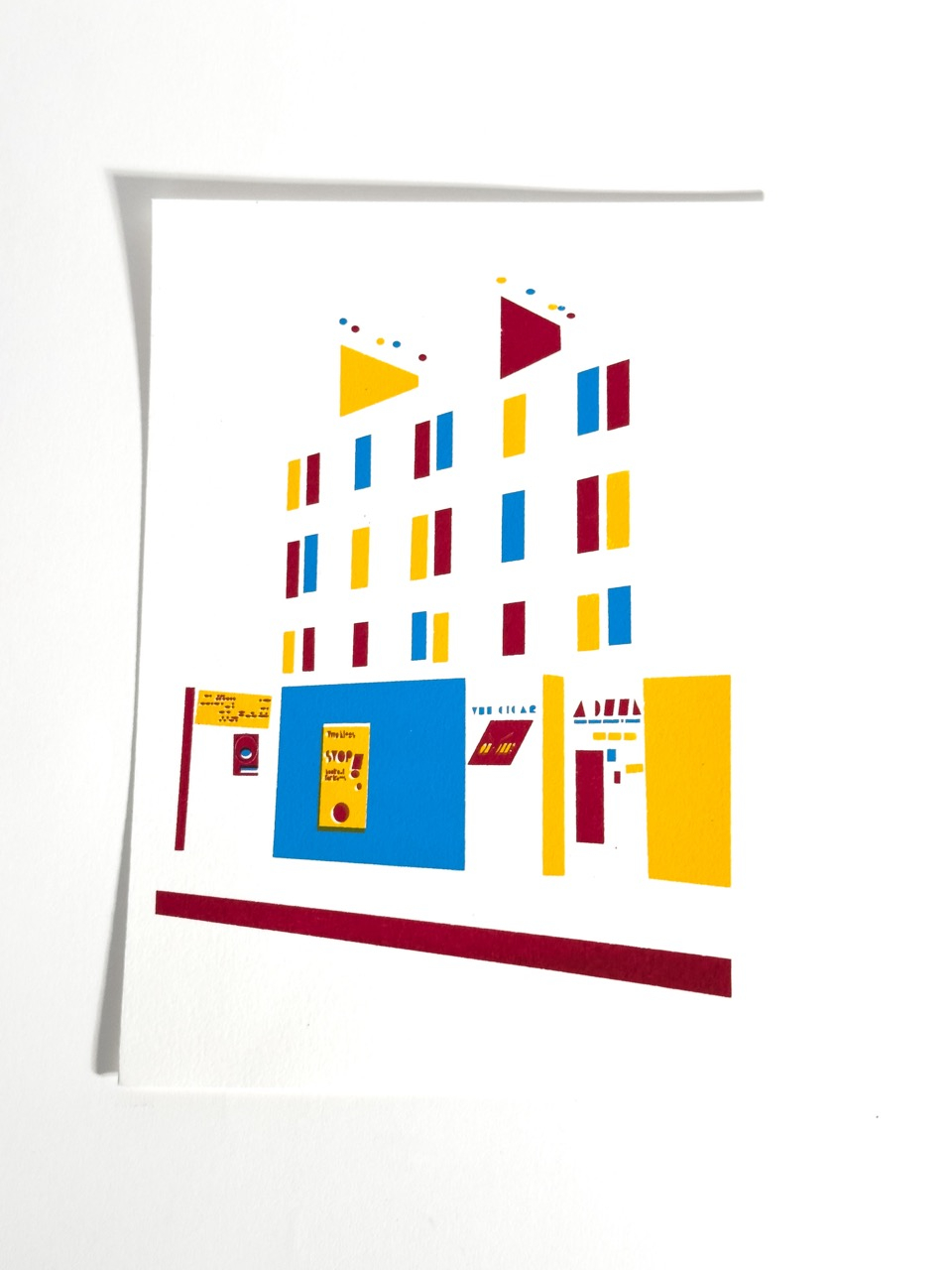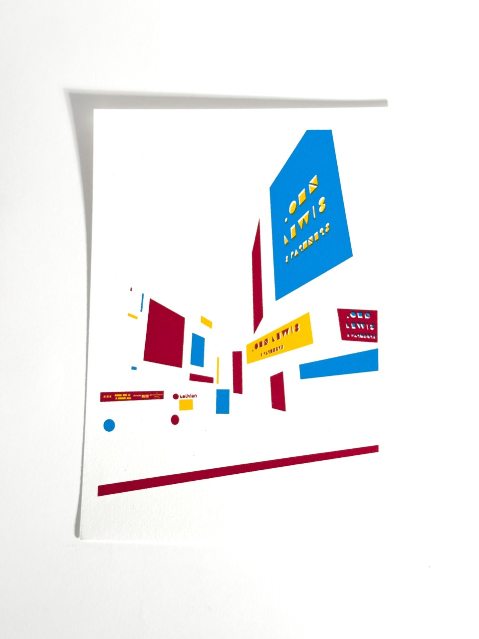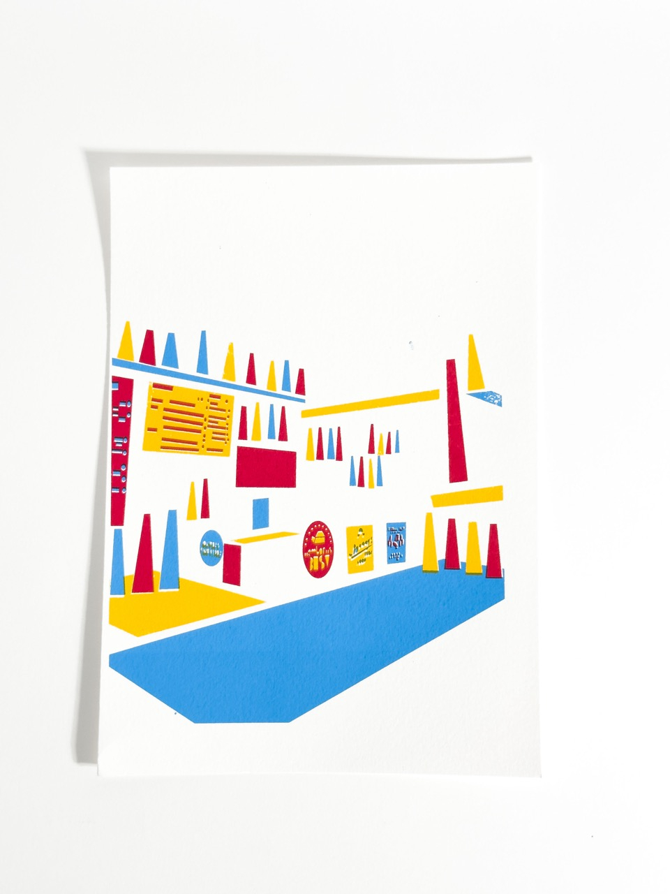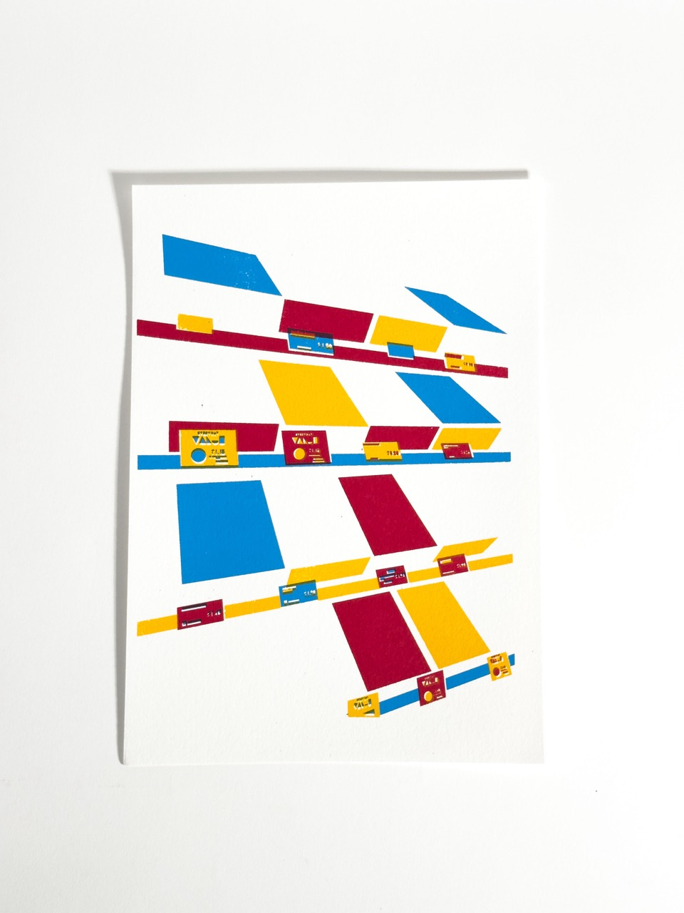
The Unseen

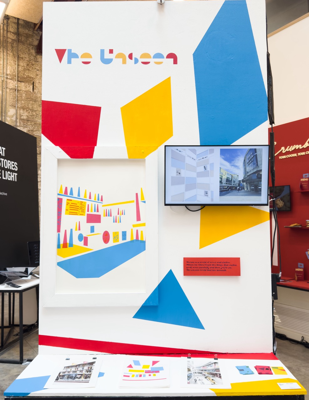
We live in a world of noise and clutter. 

Where we often forget the things that matter. 

Look more carefully and then you’ll see.  

The unseen world that lies beneath. 


Concept

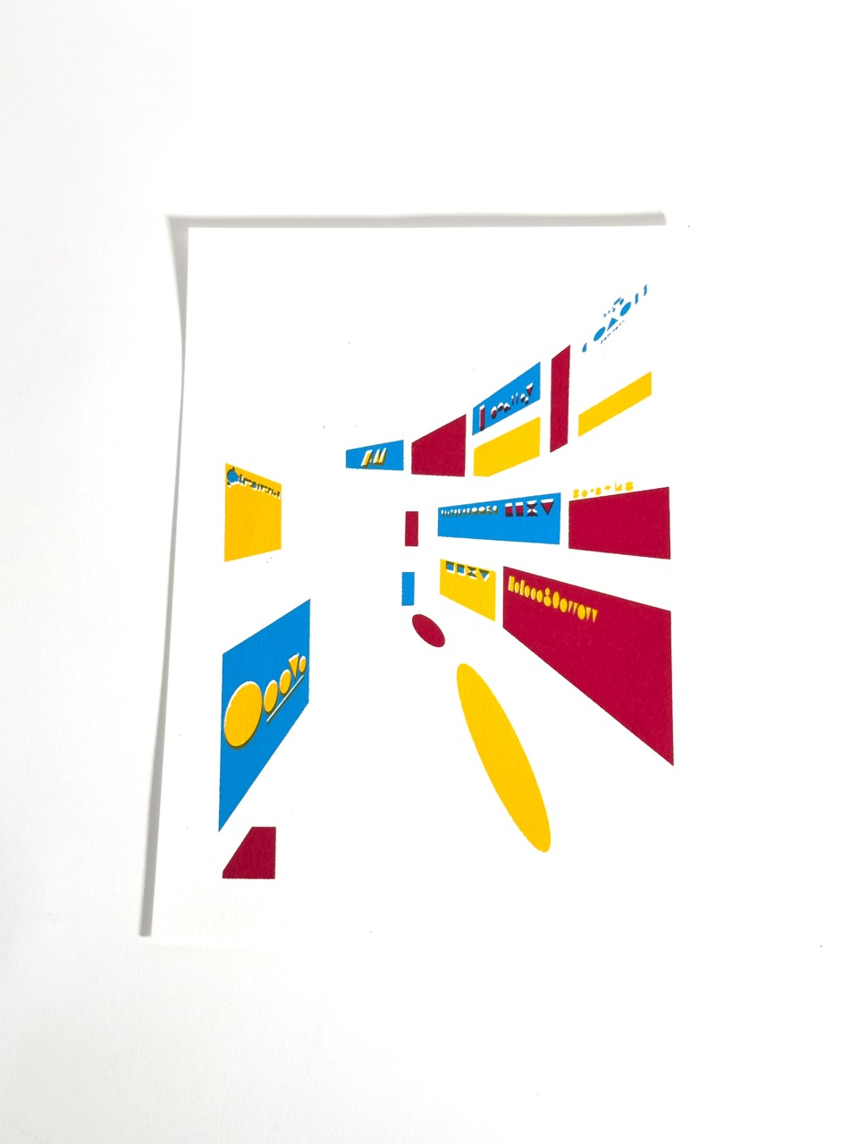
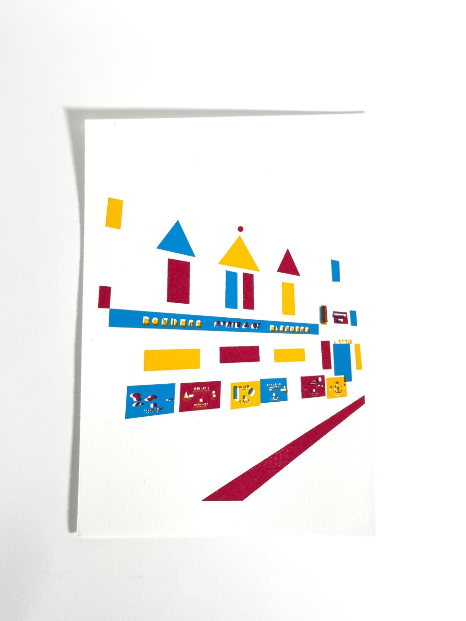
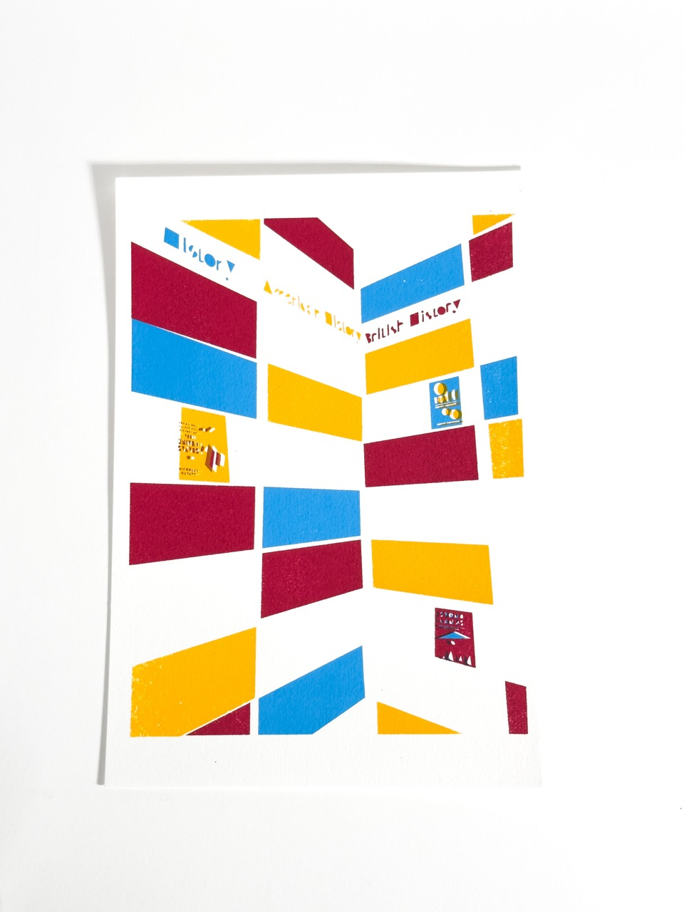
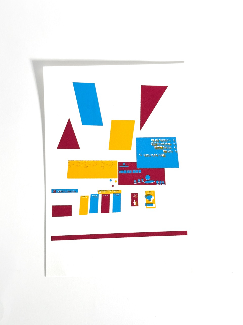
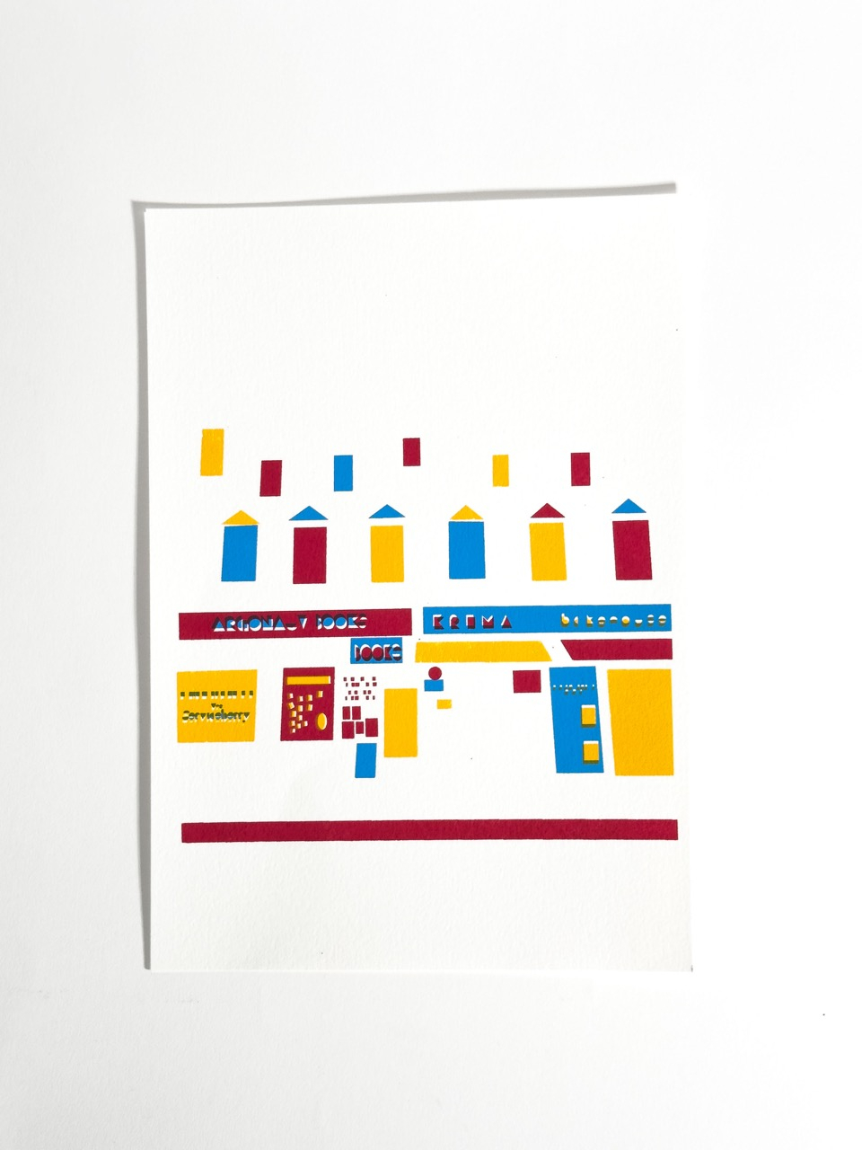
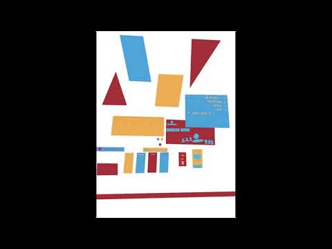
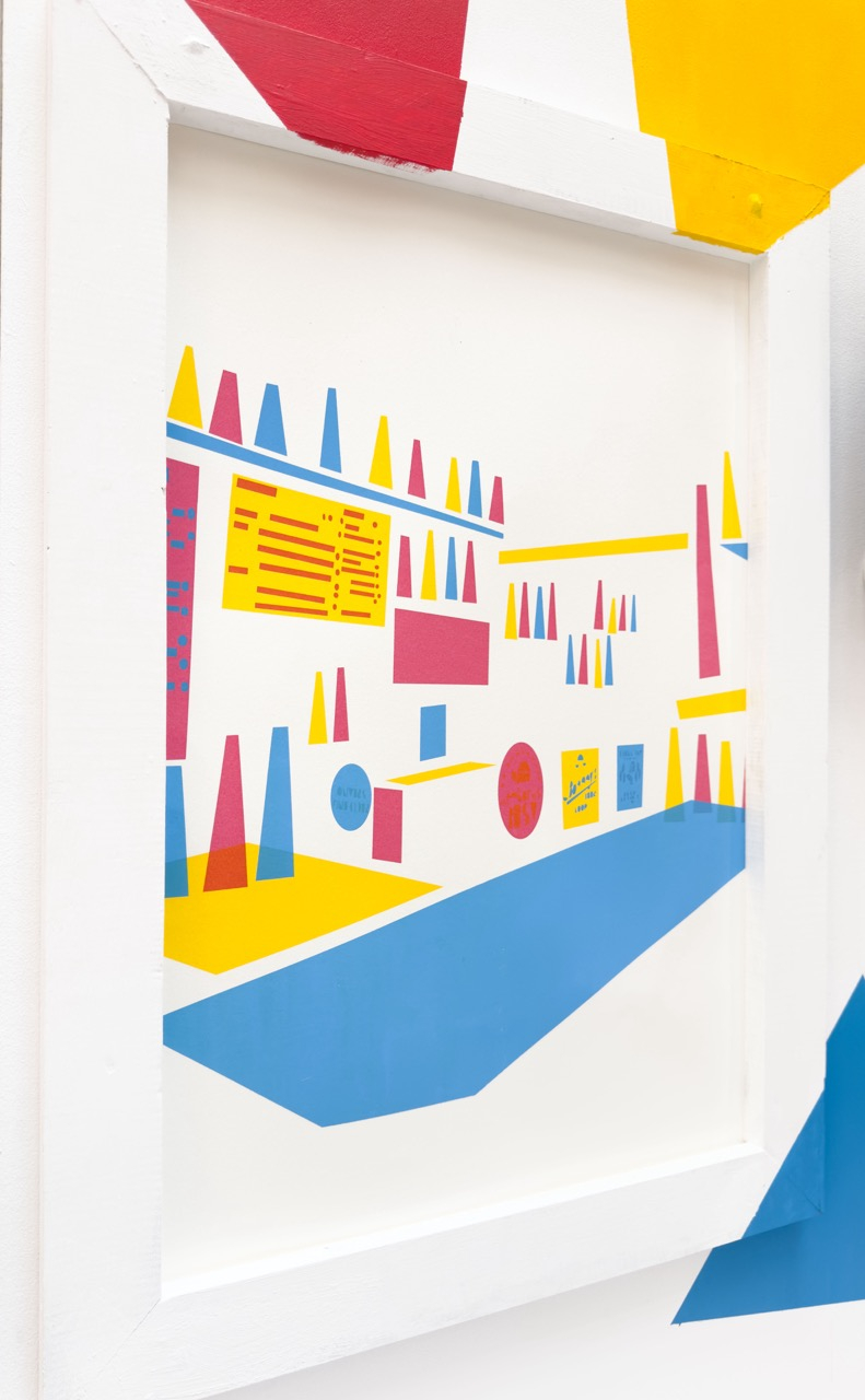
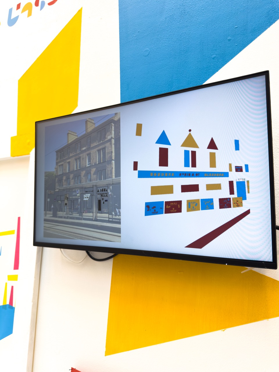
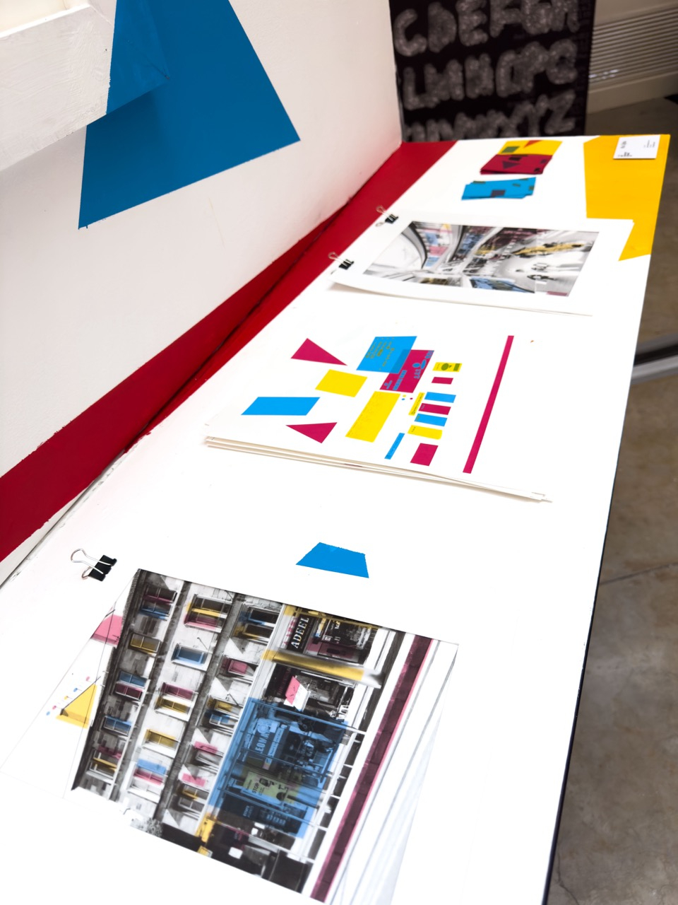
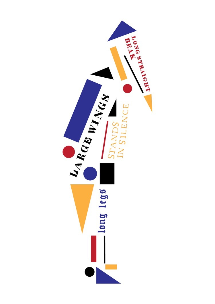
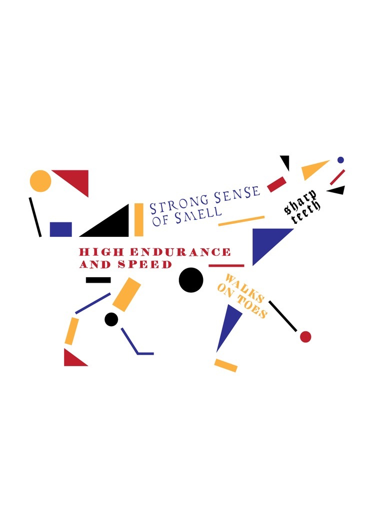
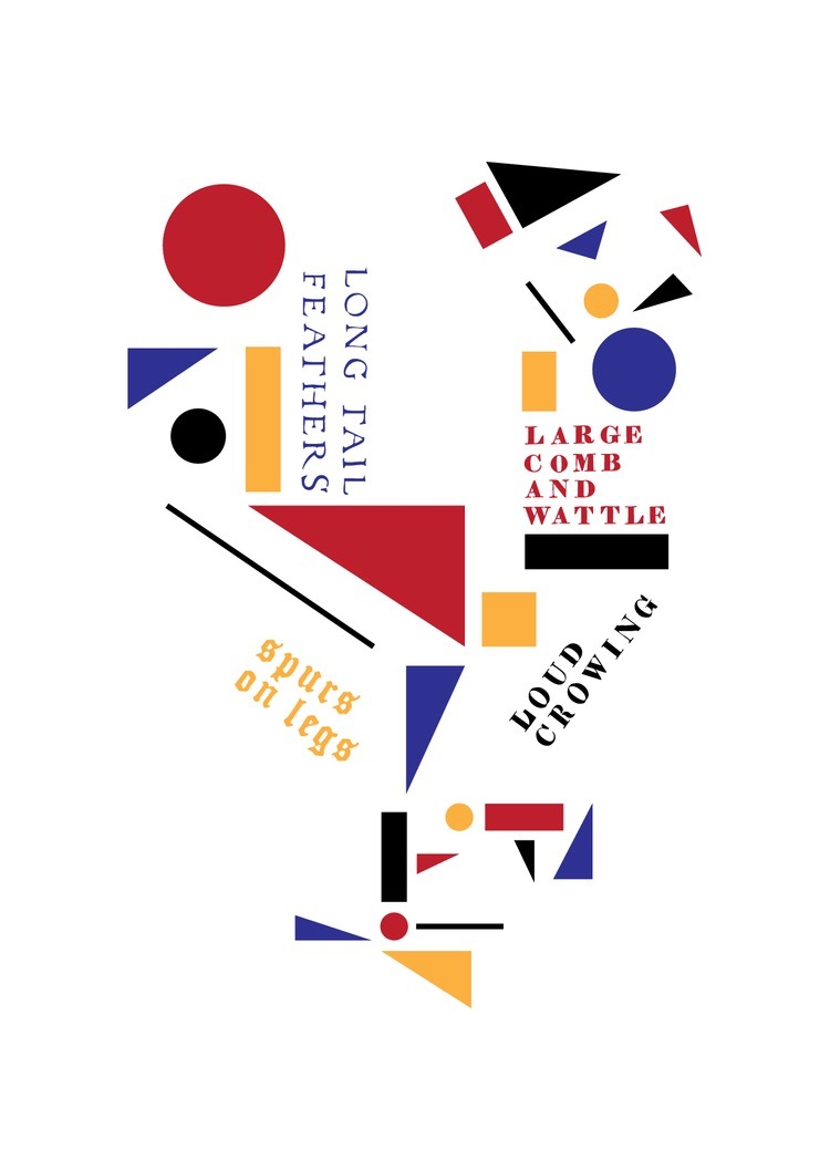
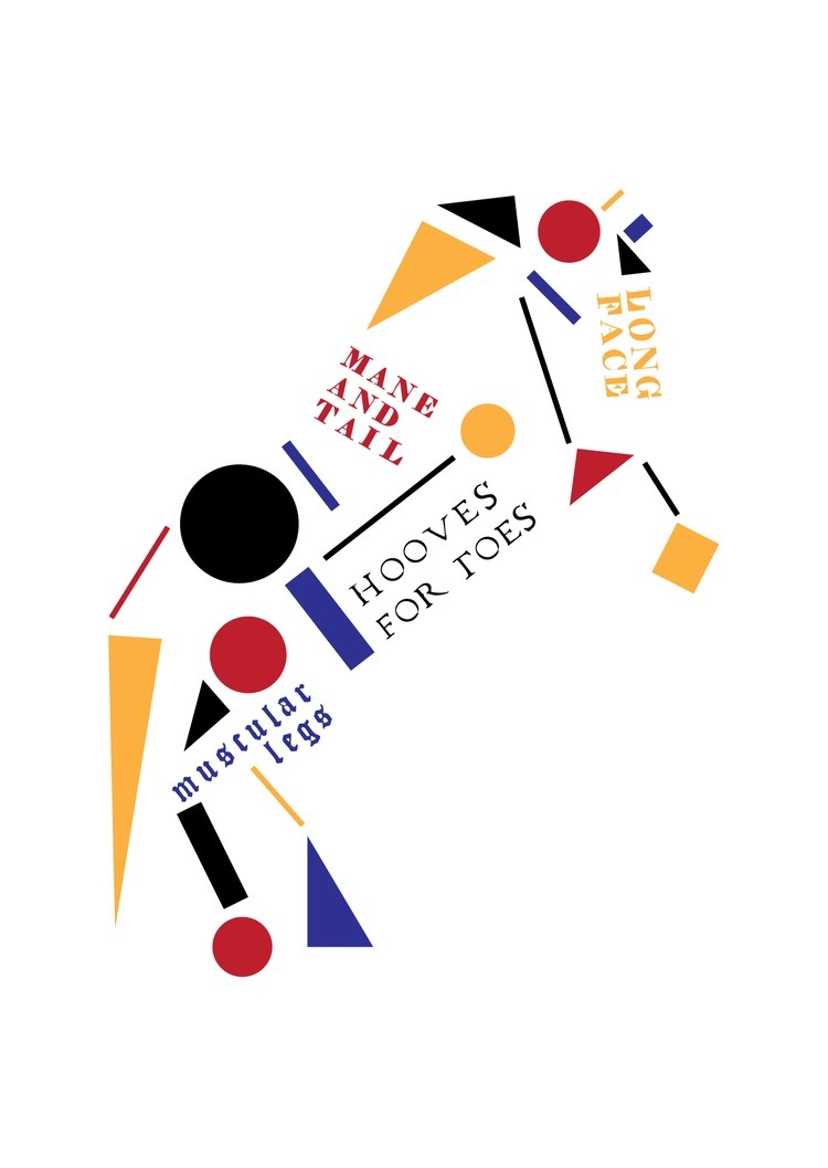
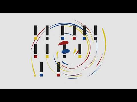
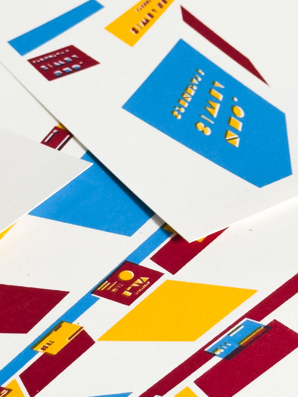
As we enter the digital age, we are met with excessive amounts of information daily. Whether that is outdoors or indoors, wherever we go, we are bombarded with noise and distractions, often leading us to overlook the most simplest things in life. 'The Unseen' aims to emphasise these missed details, presenting the audience with a conceptual view of the world if it were made up of simple shapes and forms. 
Grad Show A1 Poster Closeup
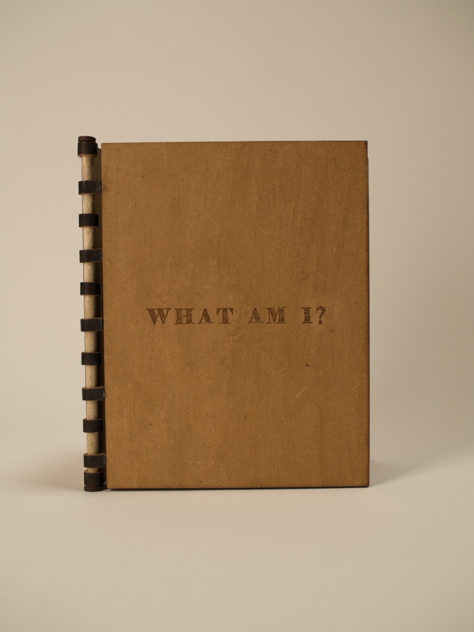
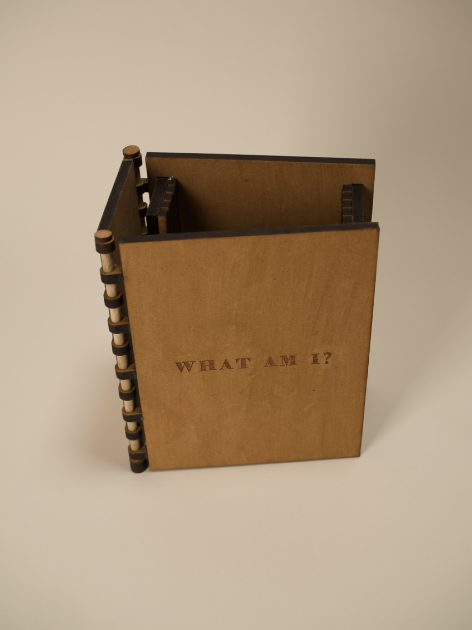
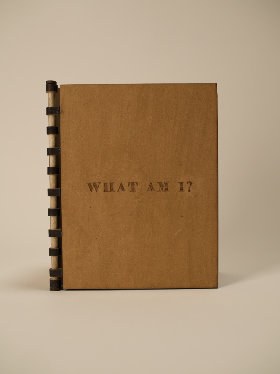
What Am I?

Task

To construct a body of research that reflects and responds to the assigned object by the University of Edinburgh’s Collection Department, ultimately leading to the production of a physical outcome. For me, this object was the Hornbook and Battledore. They are both pioneers of children’s books today, acting as a learning tool for young children in the18th century.
 

Concept

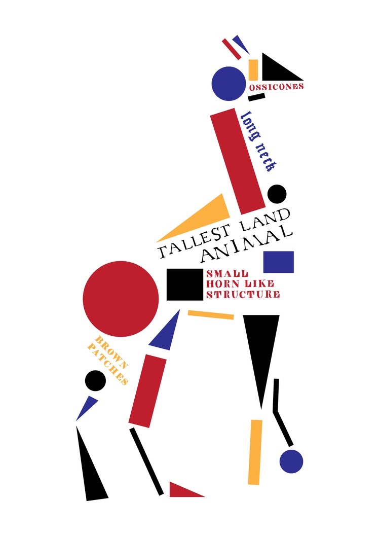
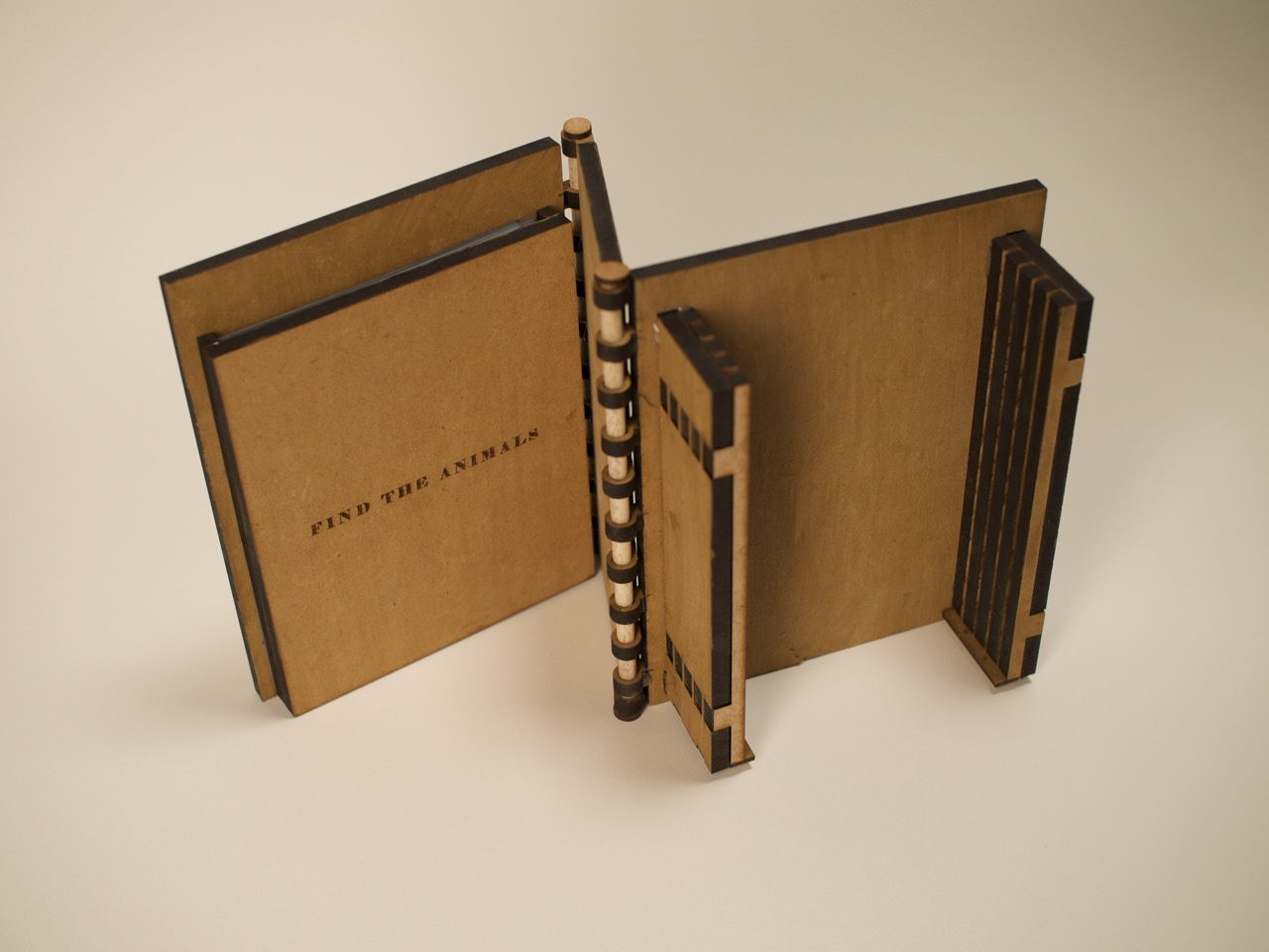
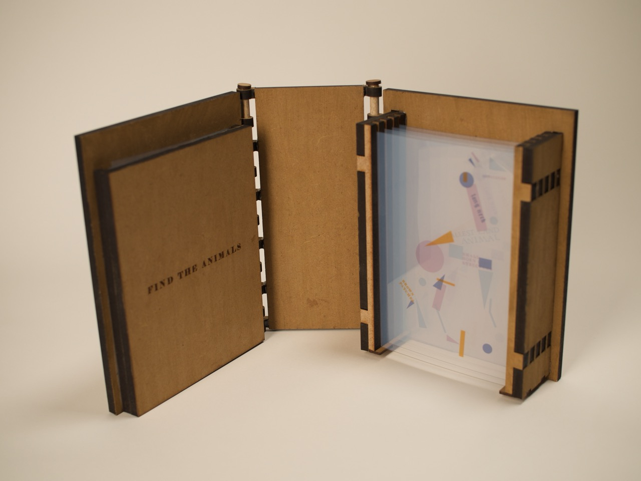
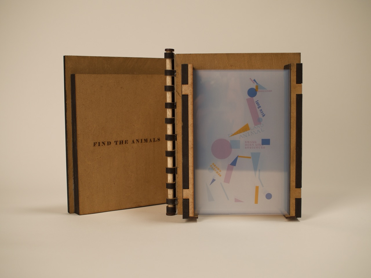
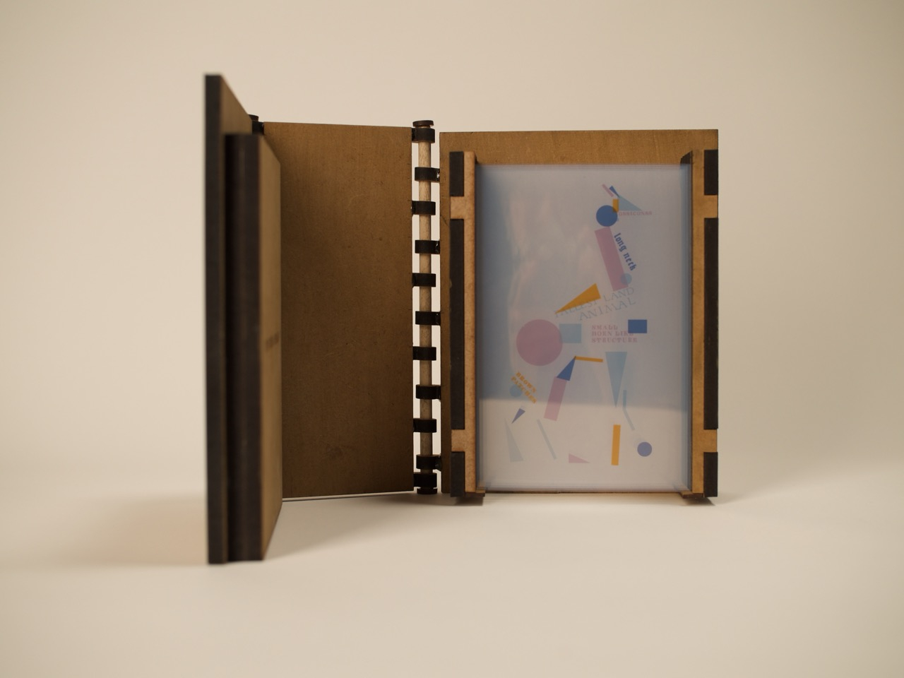
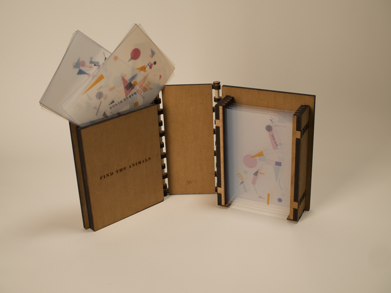
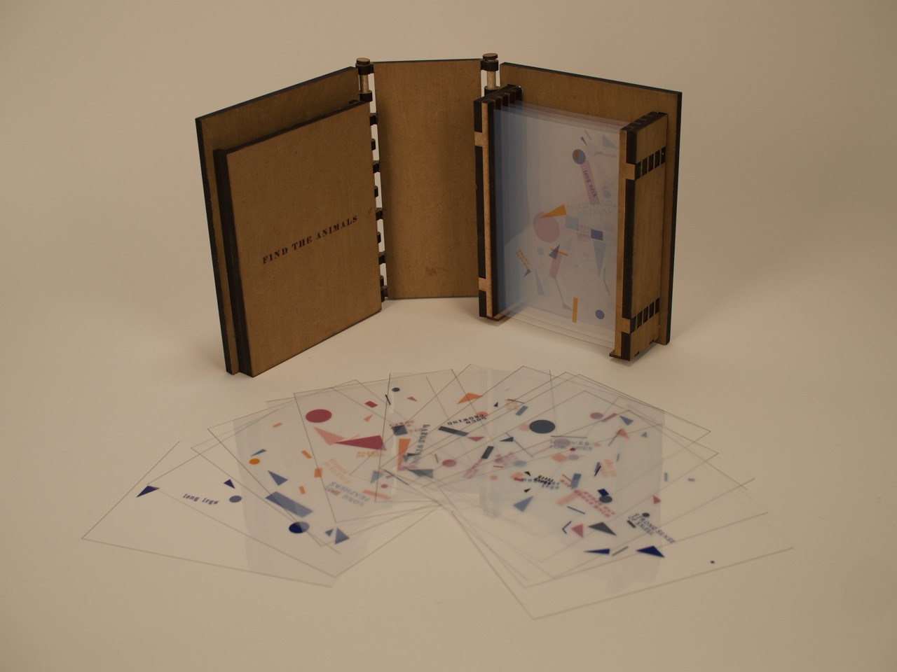
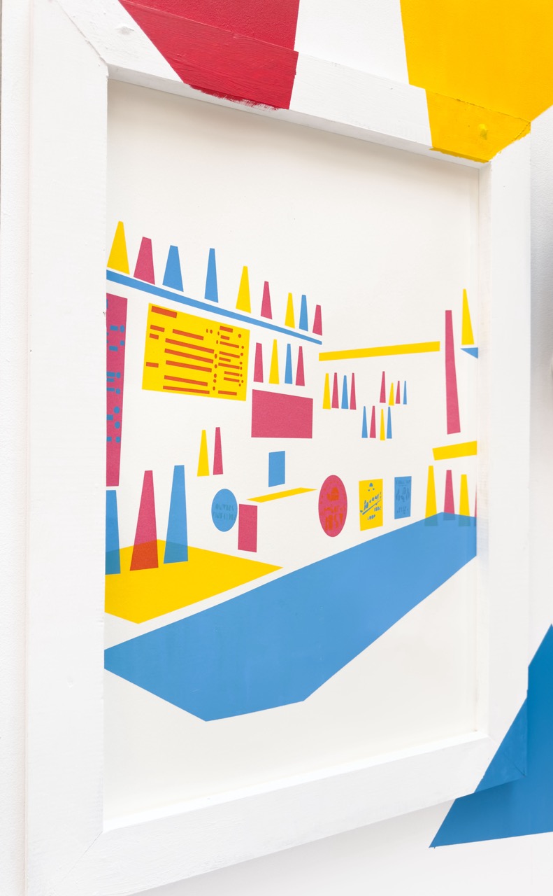
The final outcome represents the concepts of ‘layering’ and ‘concealment’, which were first explored in the research of the object and consistently developed throughout the project. Although it may seem far from the original objects (The Hornbook and Battledore), there are still hints of them remaining, such as the shapes of the animal silhouettes and the typeface used. The use of transparent paper was also originally inspired by the thin sheet of horn used for protection. The fundamental purpose has also been maintained, as “WHAT AM I?” also acts as a learning tool for children, although it has been transformed into something more modern and interactive. 

hornbook work
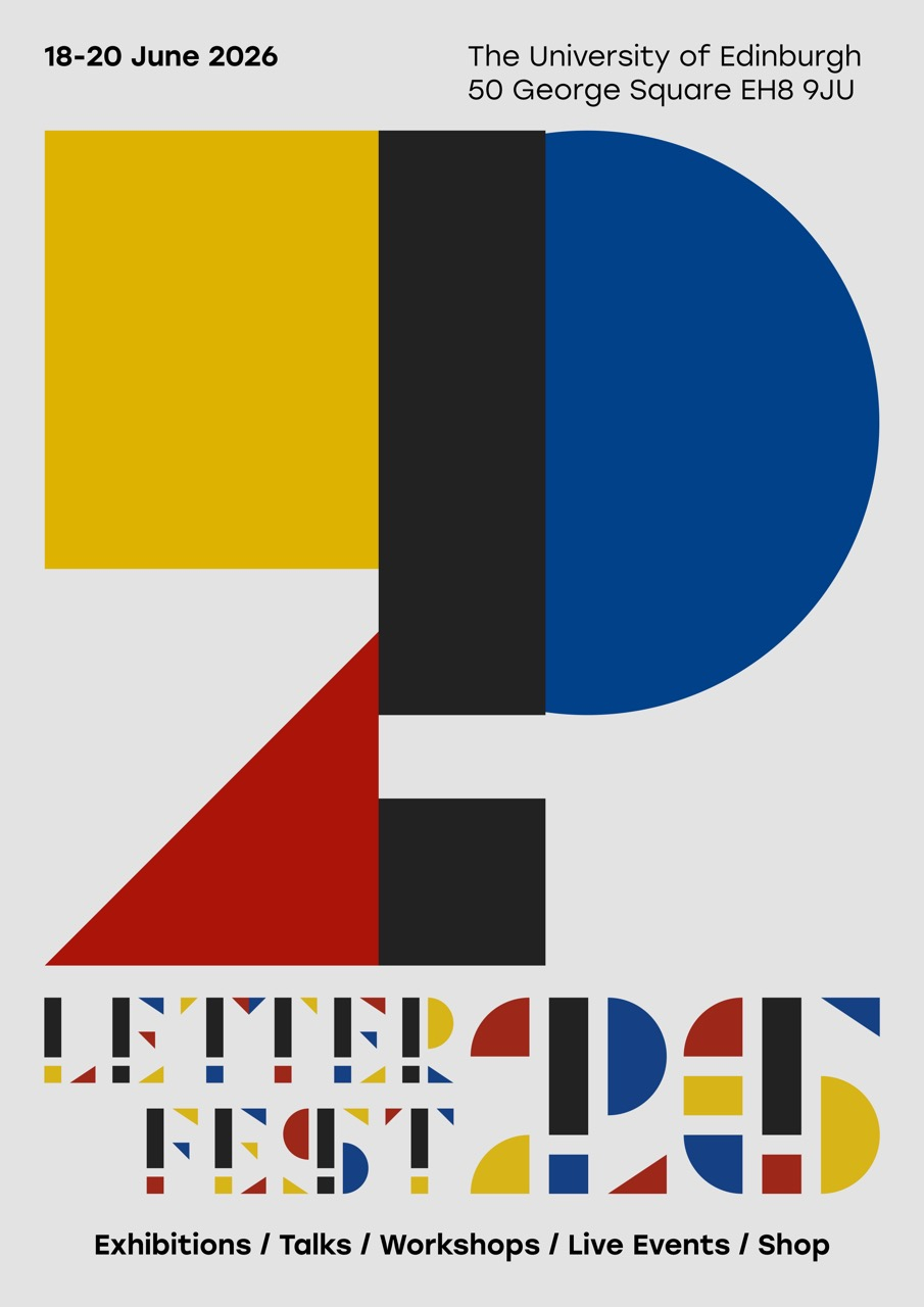
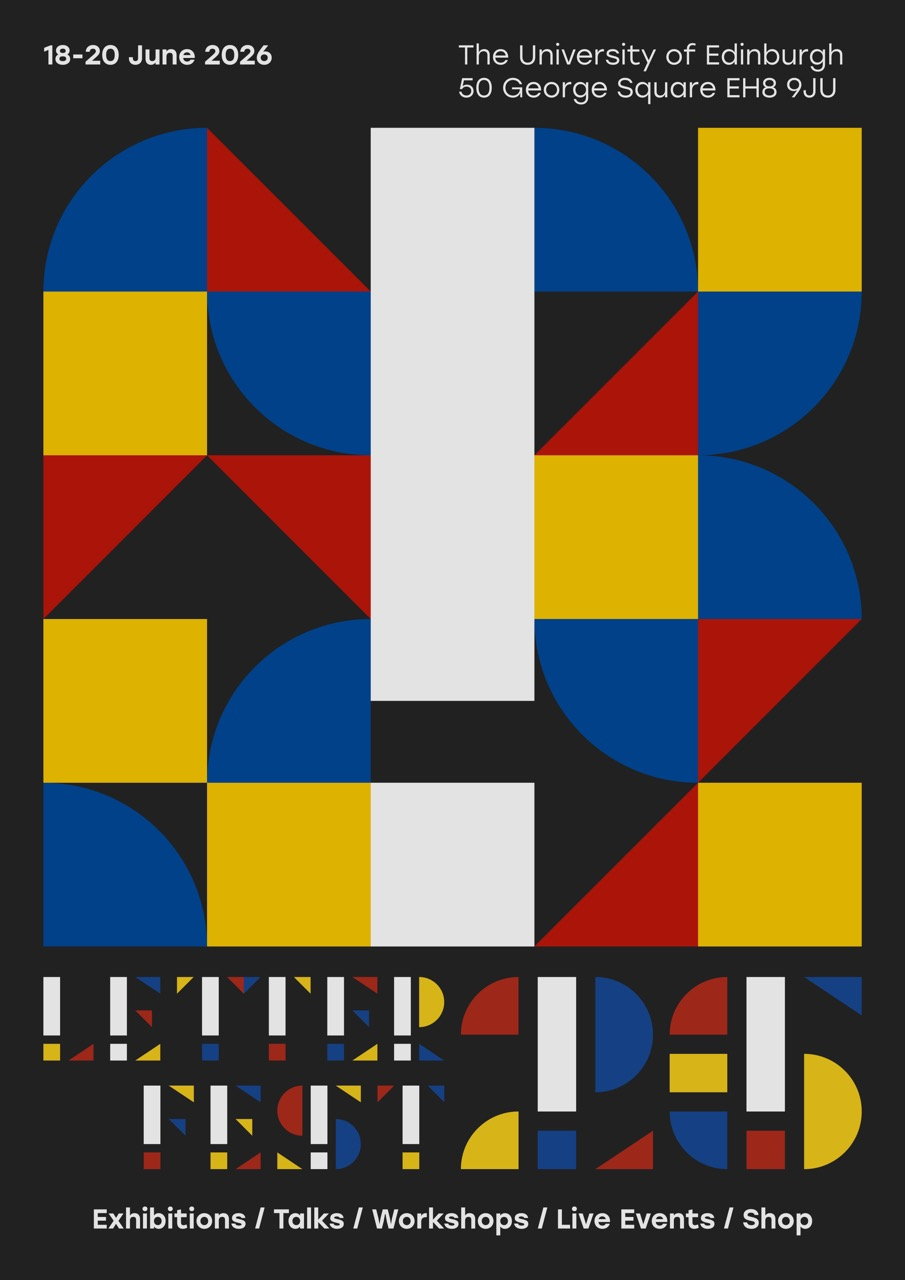
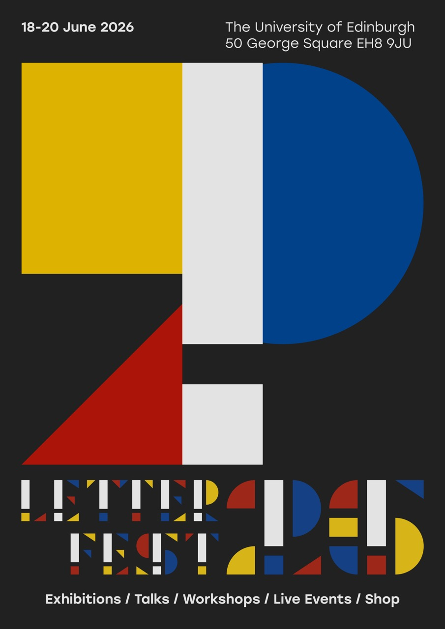
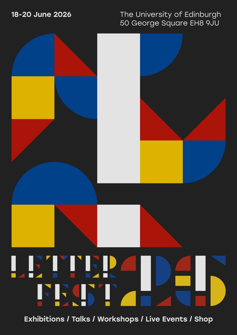
LetterFest 26

Festival Theme 

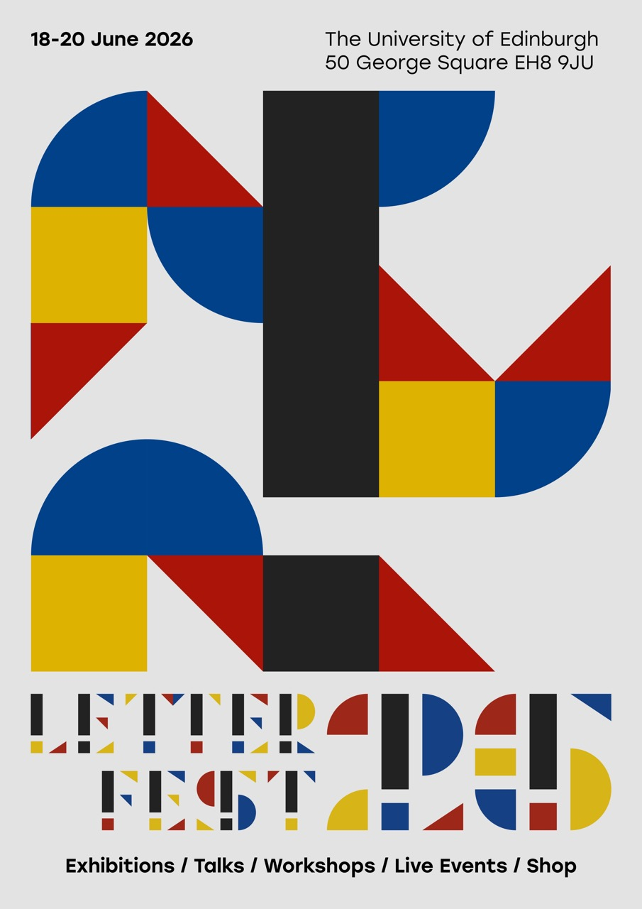
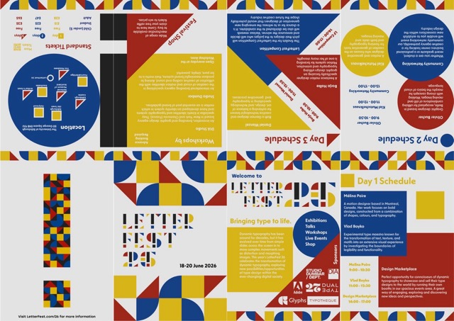
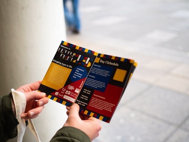
Dynamic typography has been around for decades, but it has evolved over time from simple slides across the screen into more complex movement such as distortion and morphing images. LetterFest 26 celebrates the transformation of Dynamic Typography, exploring new possibilities and opportunities for type design within our modern, ever-changing digital society.
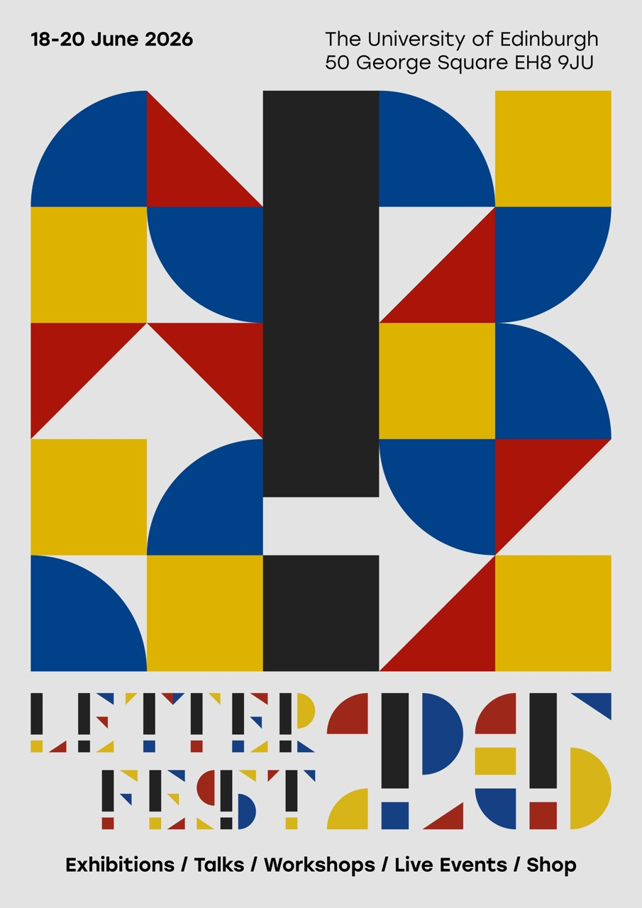
 

Brand Identity

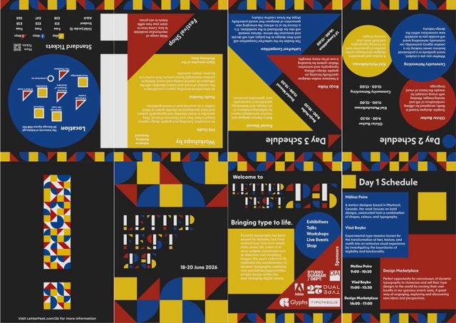
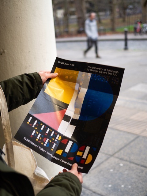
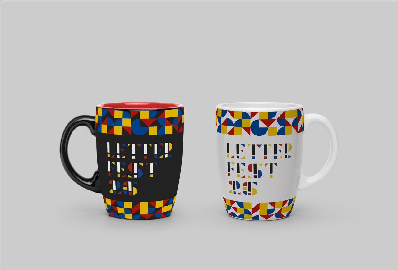
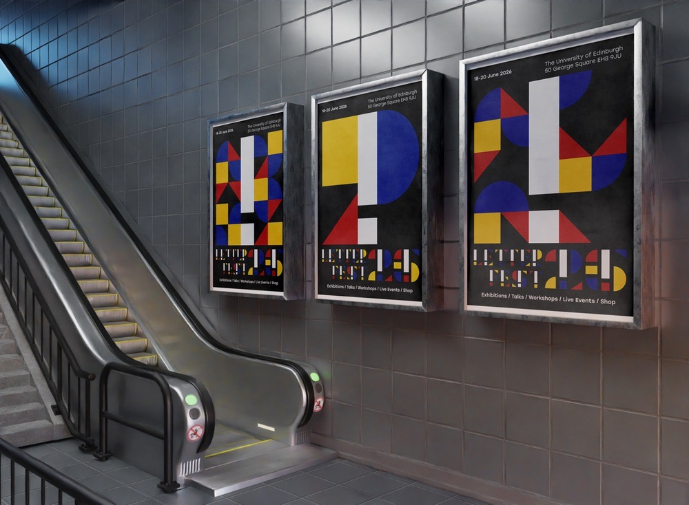
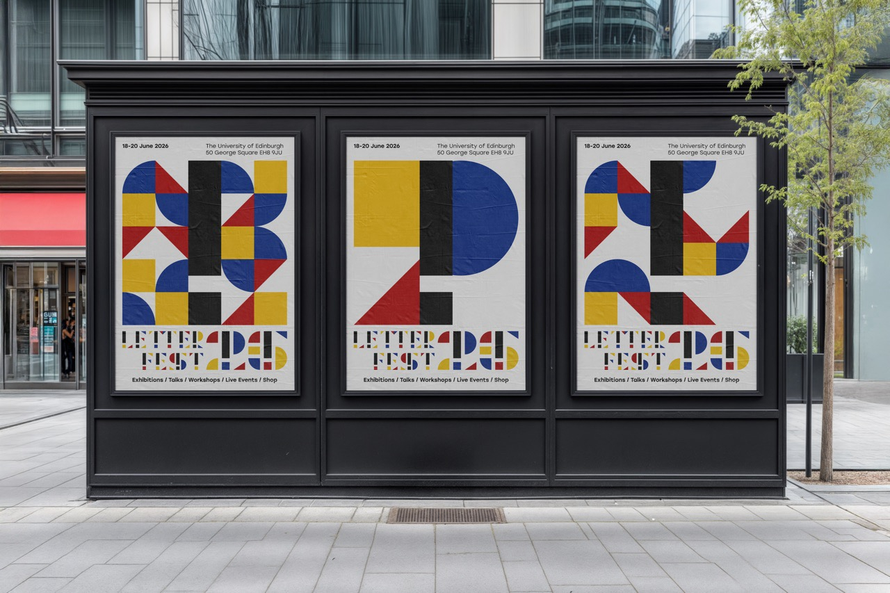
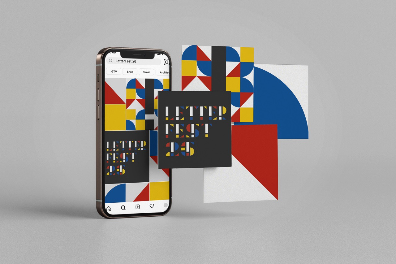
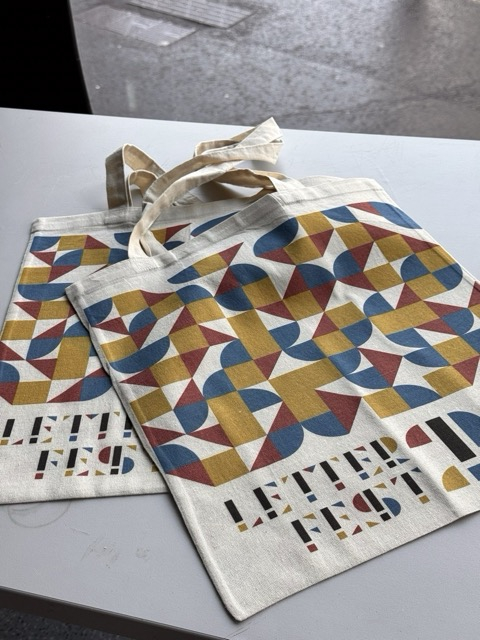
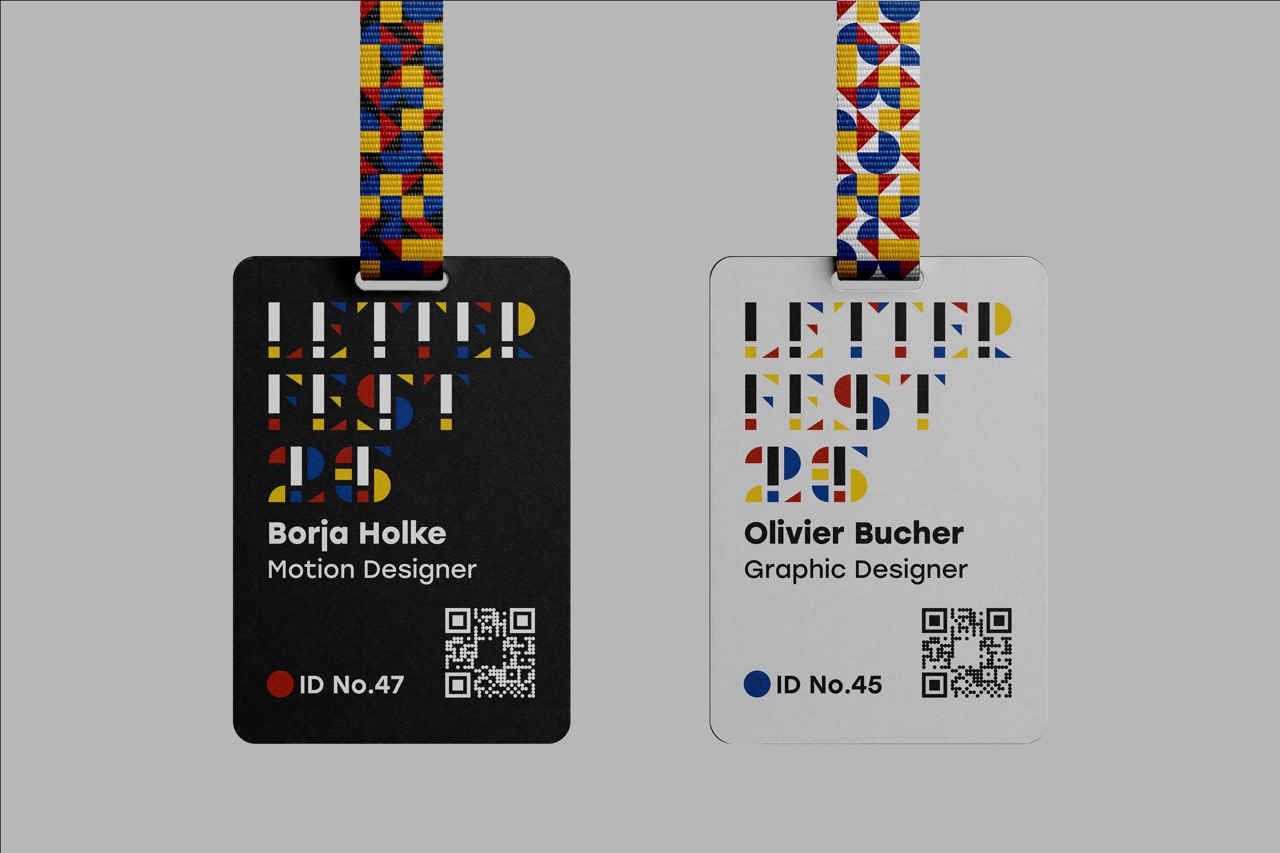
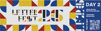
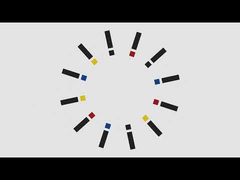
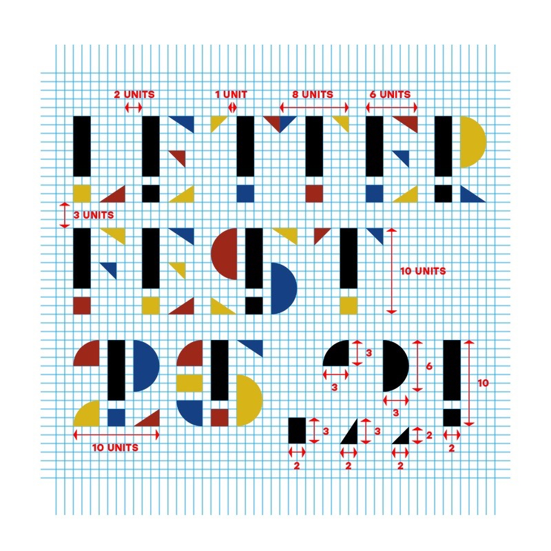
The design concept for the brand identity for LetterFest 26 is ‘Shaping Typography’. It explores how simple shapes can be utilised to construct type and how they can be easily manipulated to form new shapes and ideas. It works well with the festival theme as its simplistic design enables motion graphics to be smoothly applied to the logos and other supporting identities. The act of building is also a motion itself.

letterfest logo