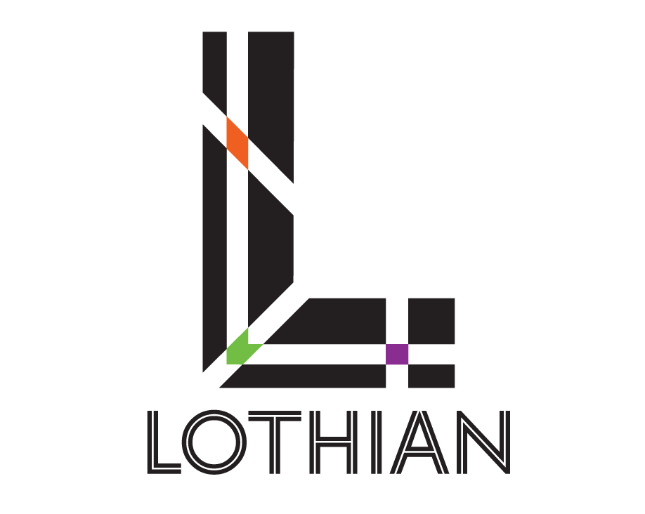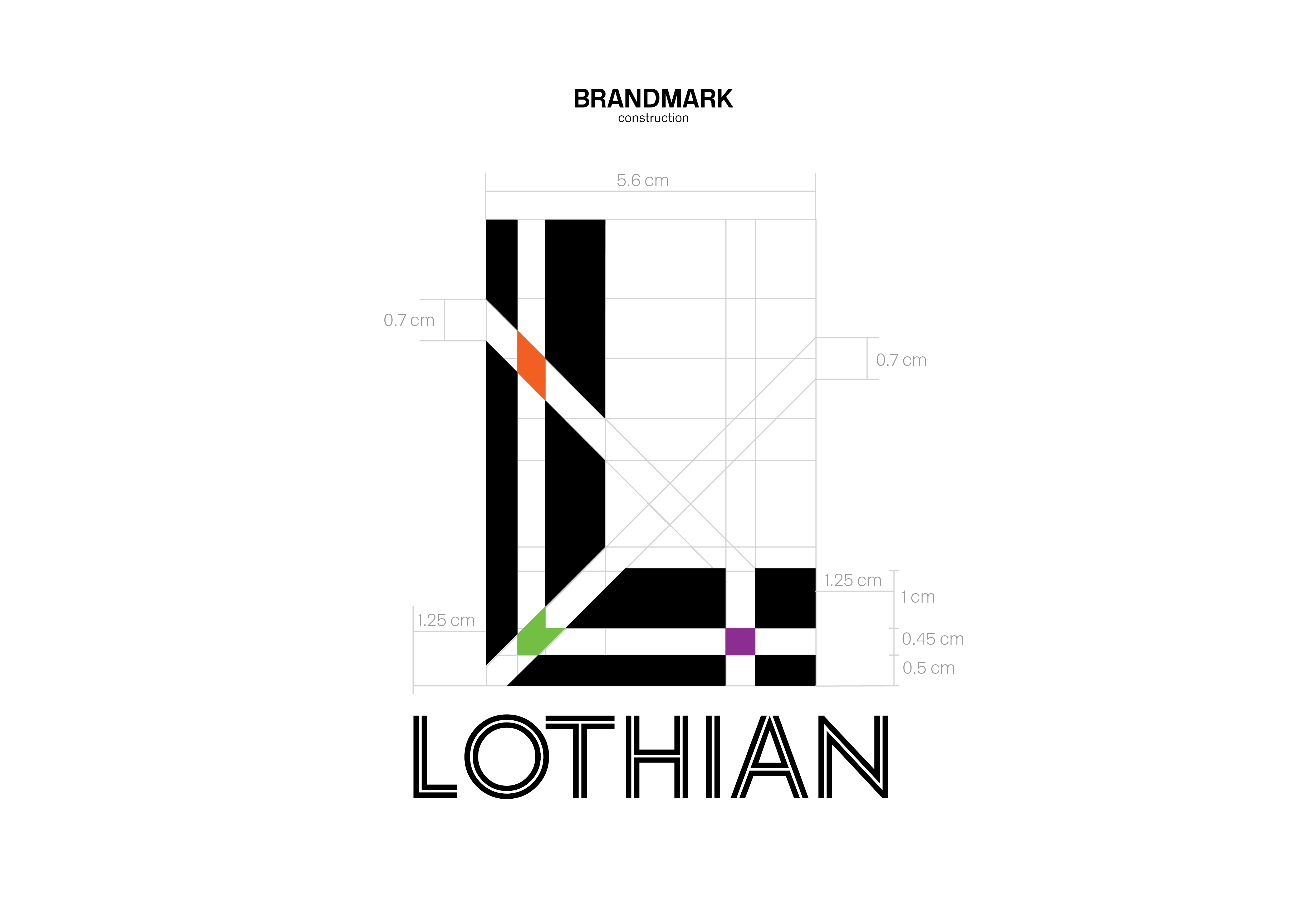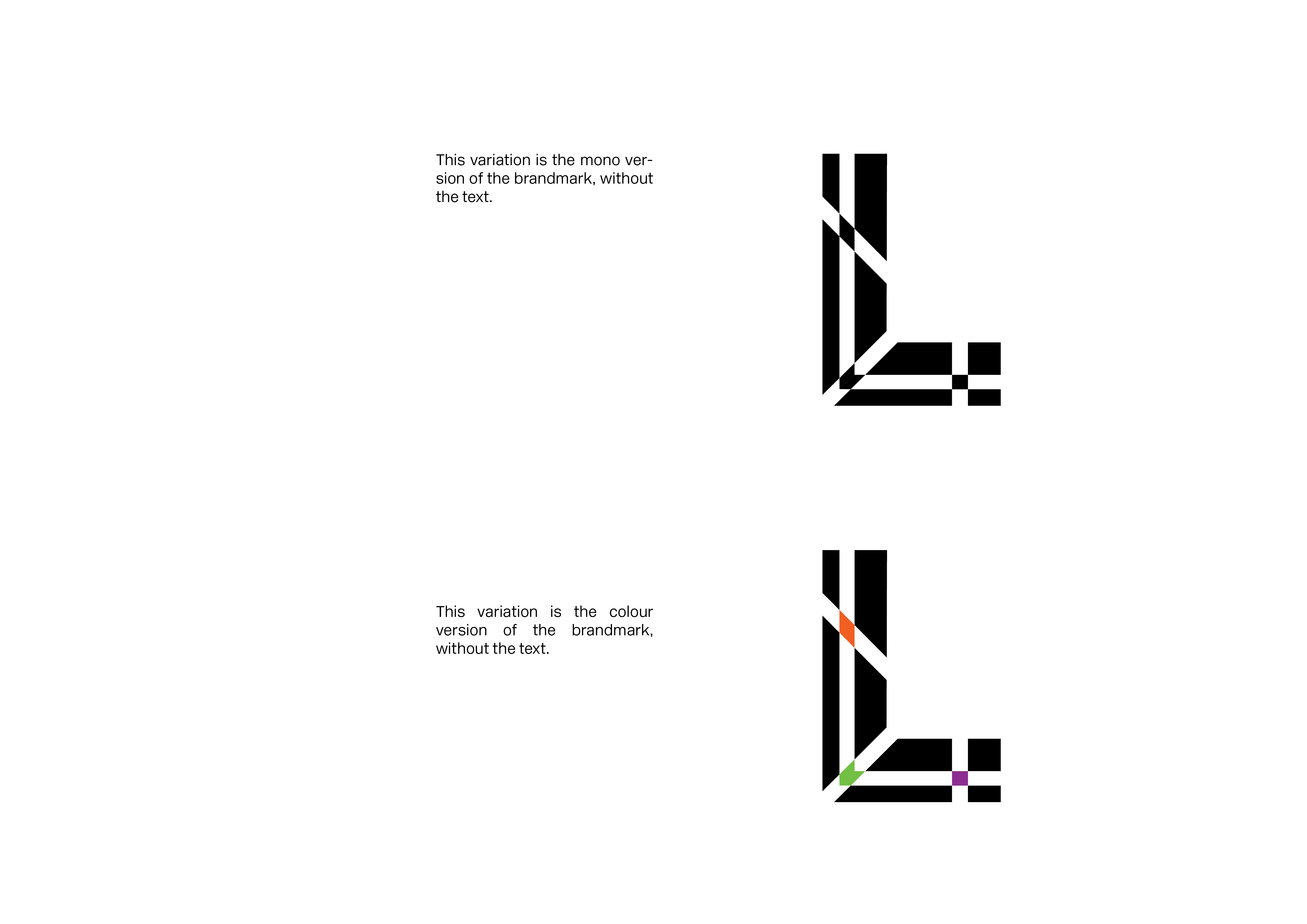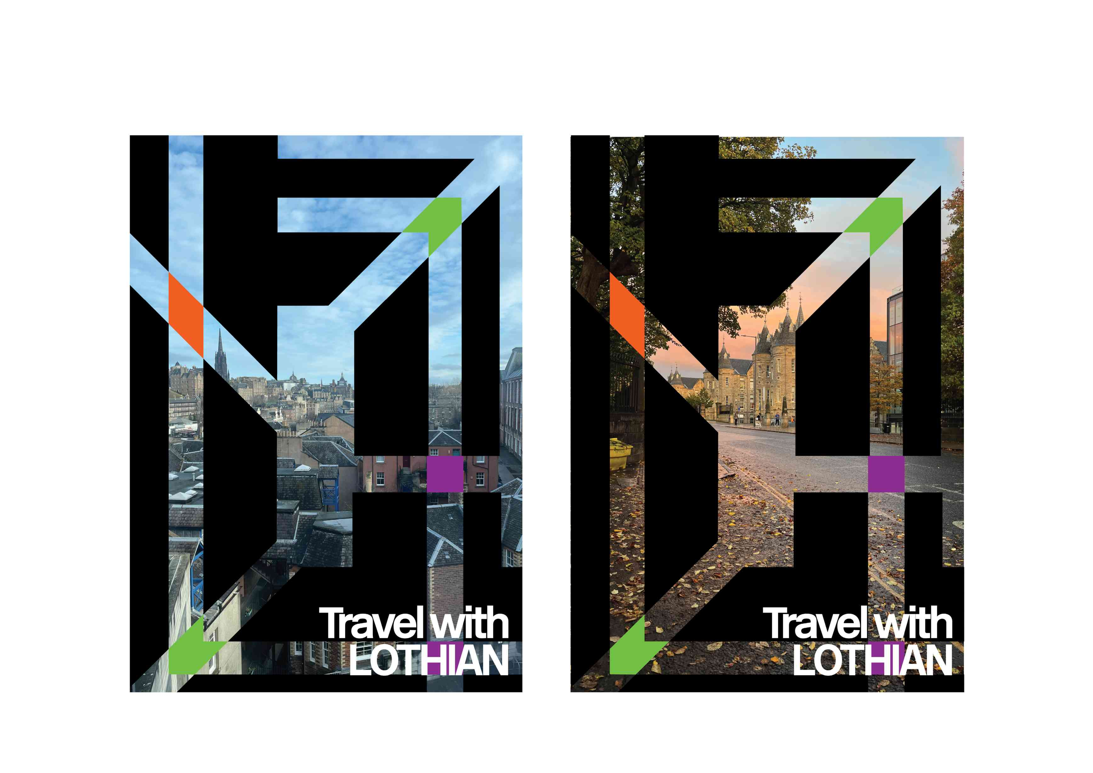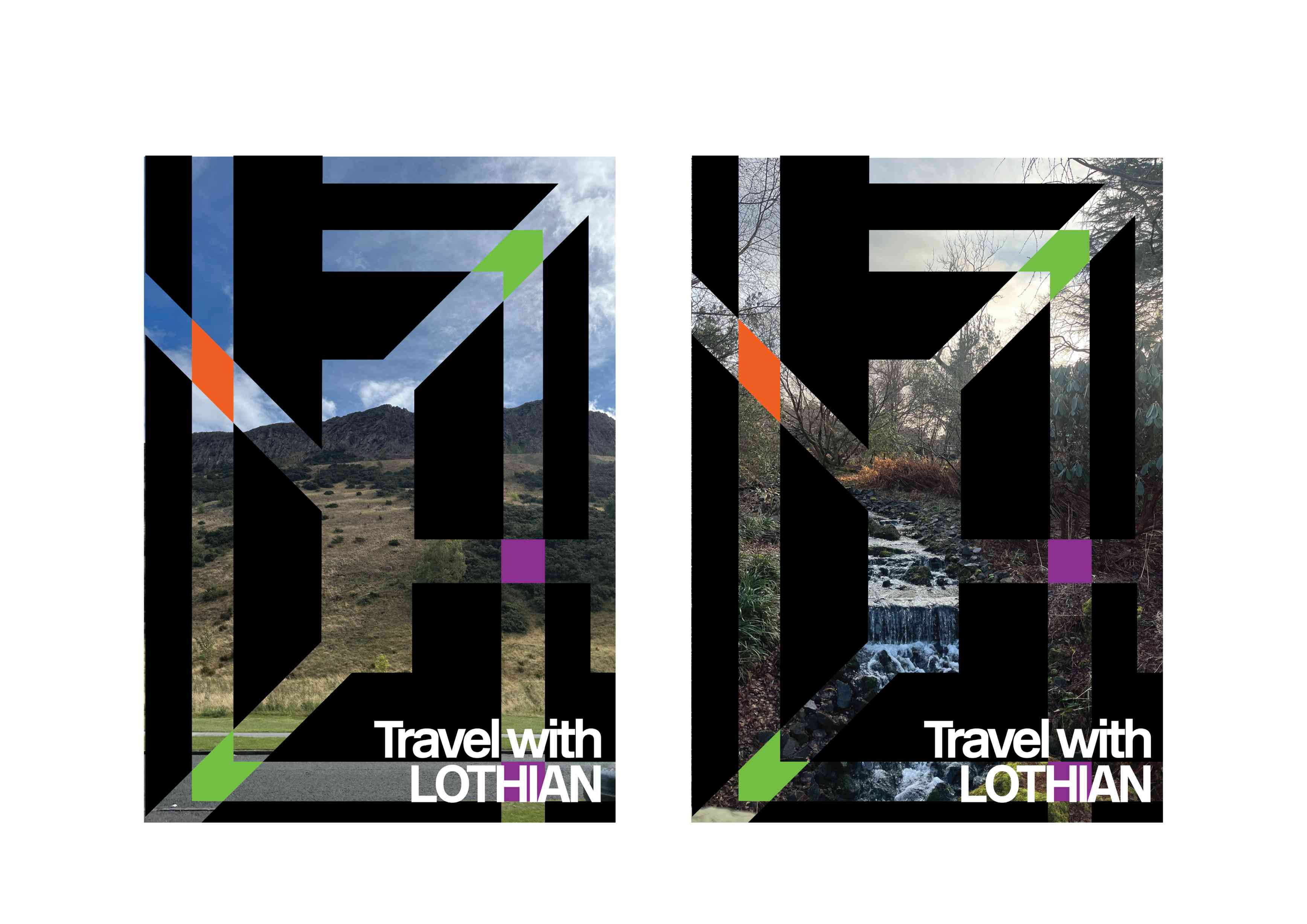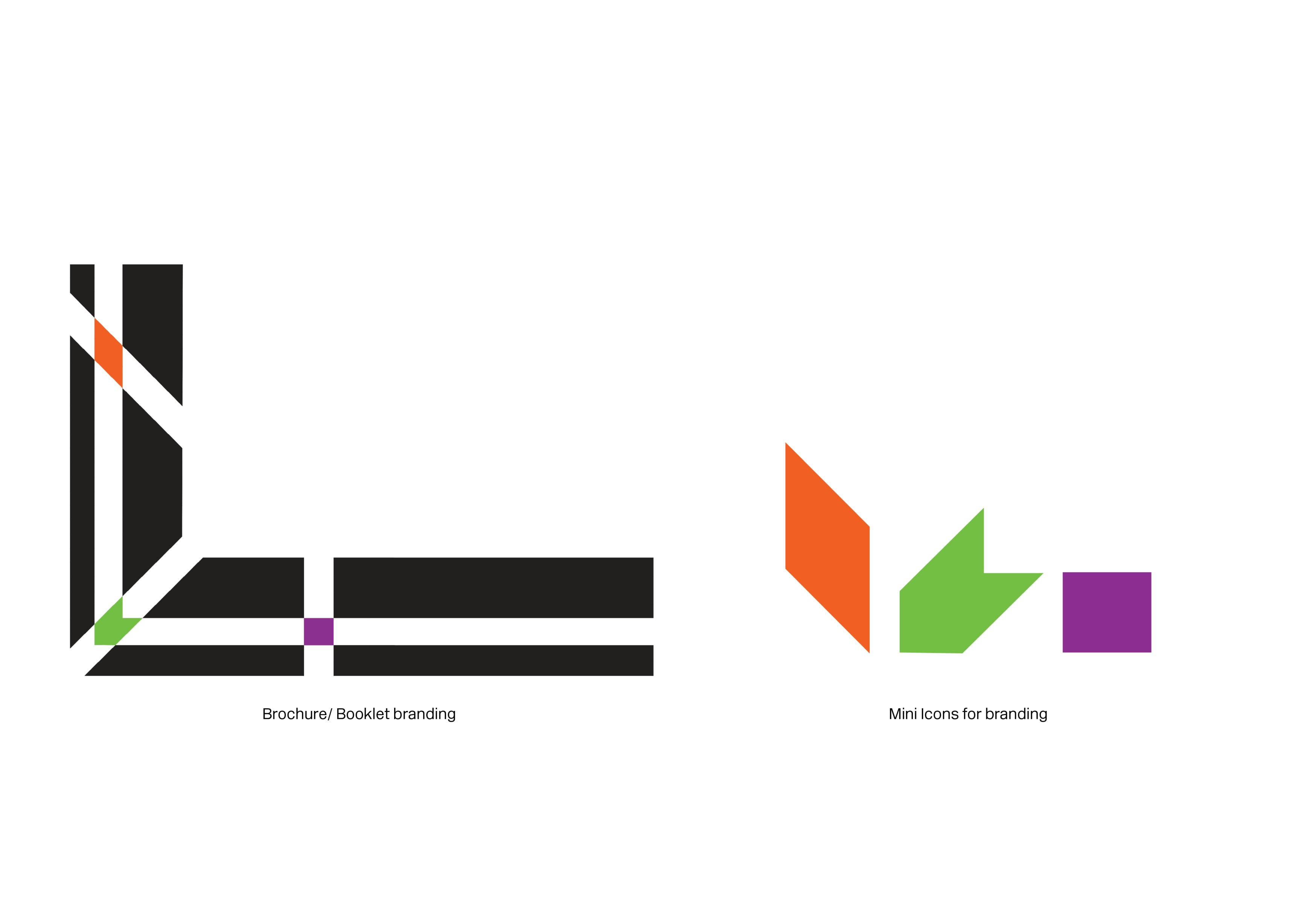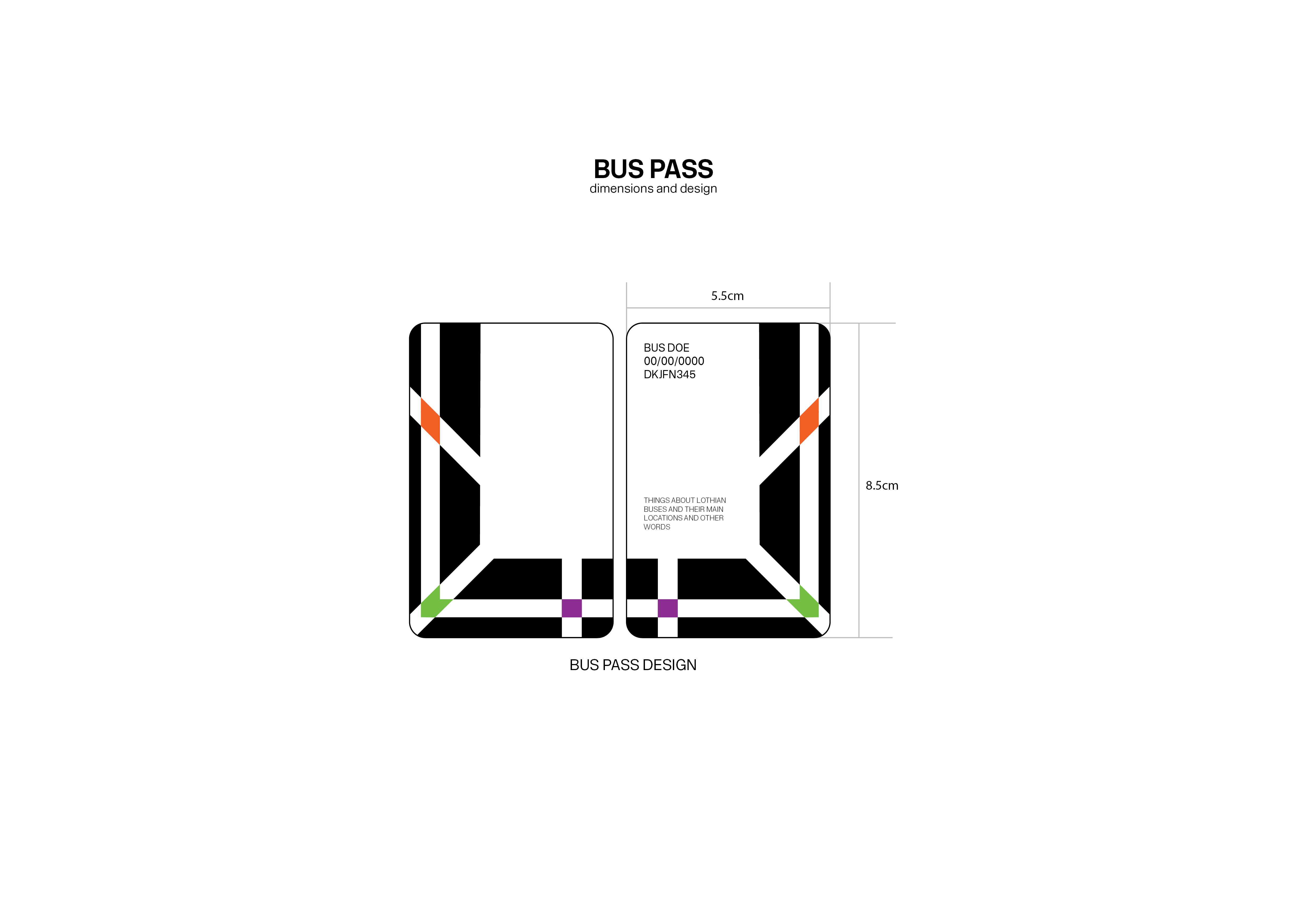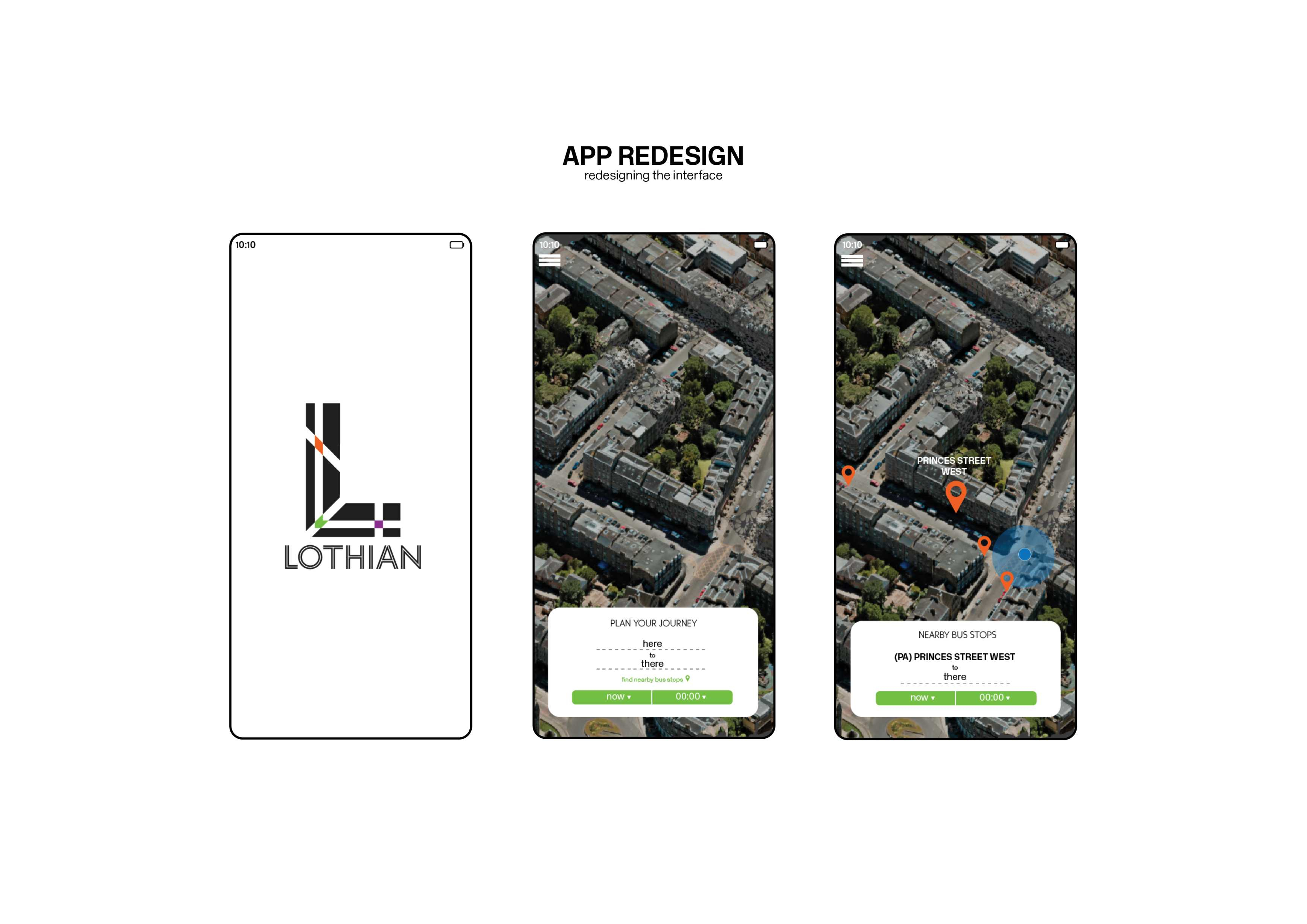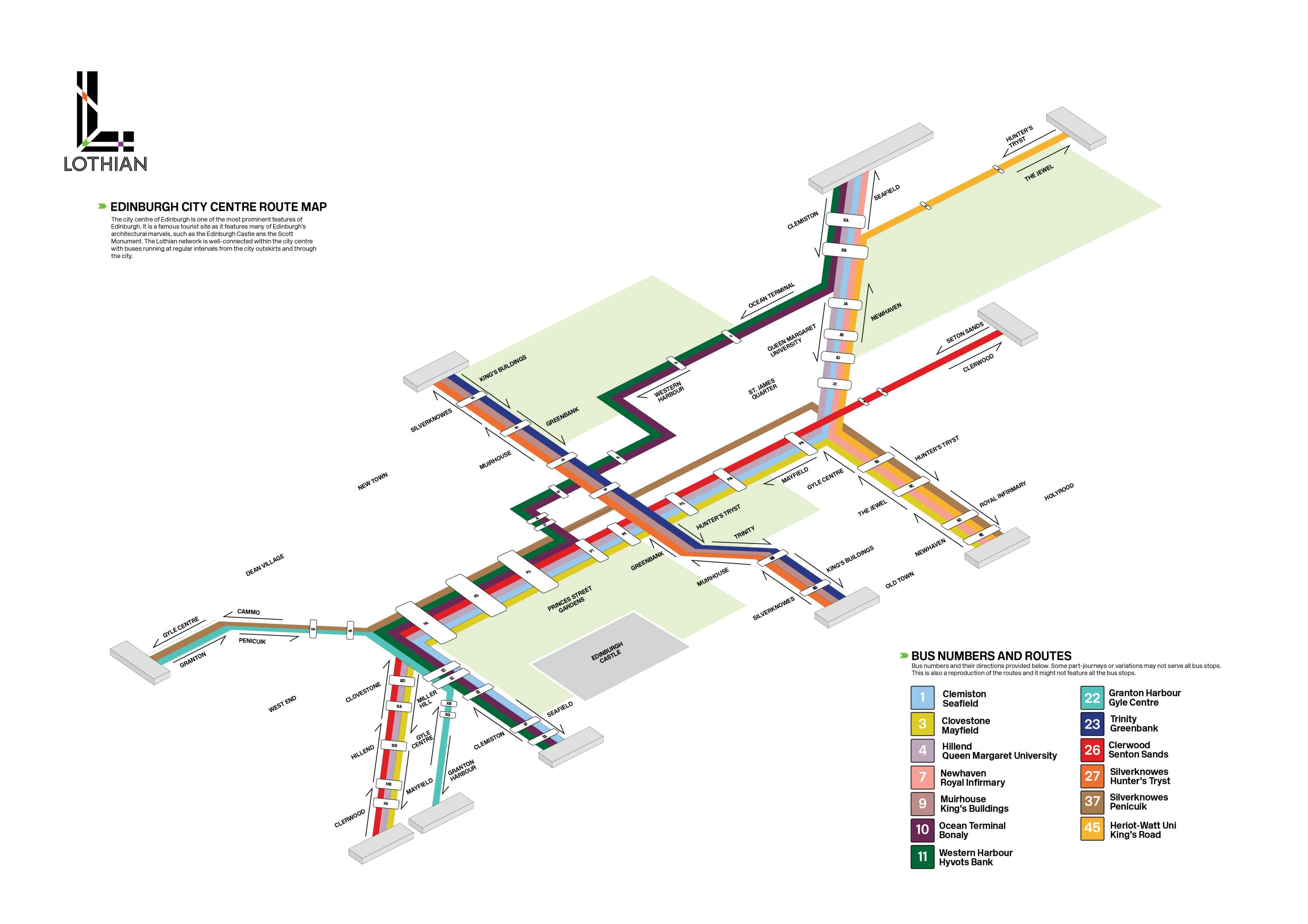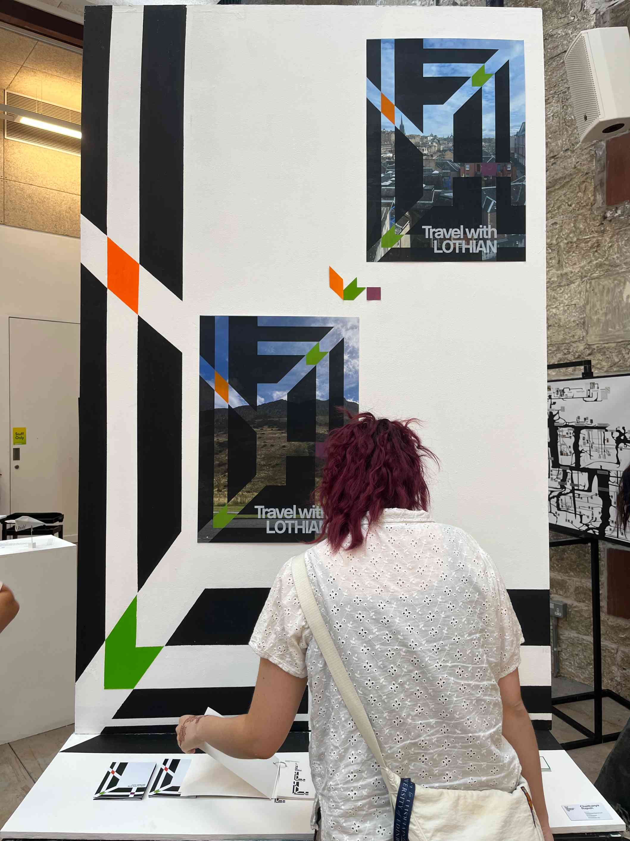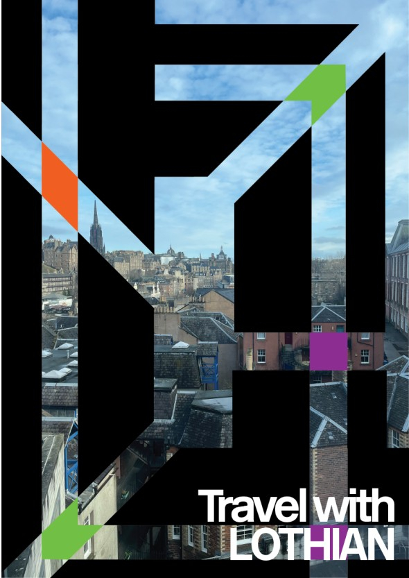
The brandmark represents the city by being almost akin to a top view of the street layout, with the city centre’s grid iron pattern and the outer ring of the city having more angled roads, bringing in the nuance of the road structure of Edinburgh, all represented withing the ‘L’ of Lothian.
The smaller coloured icons within the logo brings in a pop of colour while representing cartographic symbols. The colours were taken from the bus route colours from the official Lothian branding, as well as being distinct colours that would translate over to differentiate between the various sub-branches of Lothian.