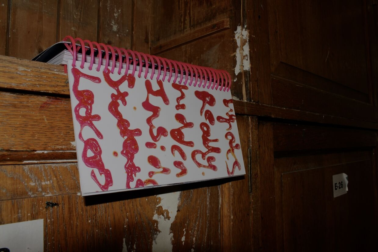
Project description

Just in case

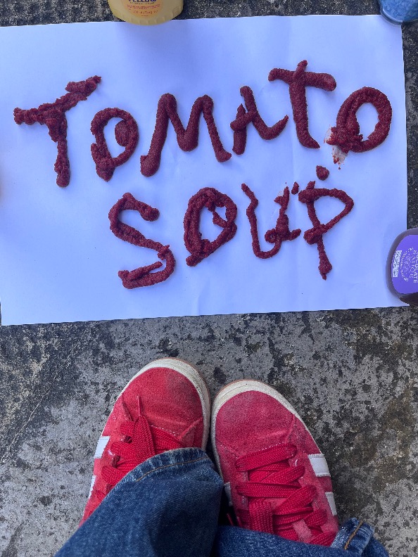
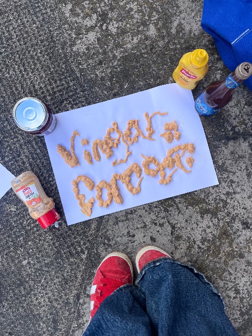
Created in response to the brief Best Kept Secret, this typographic publication explores the hidden world inside art school lockers. While every locker appears identical from the outside, behind each door is a personal collection of objects that reflects the habits, routines, and realities of student life. The "secret" lies in the items students choose to keep tucked away simply because they might be useful one day.

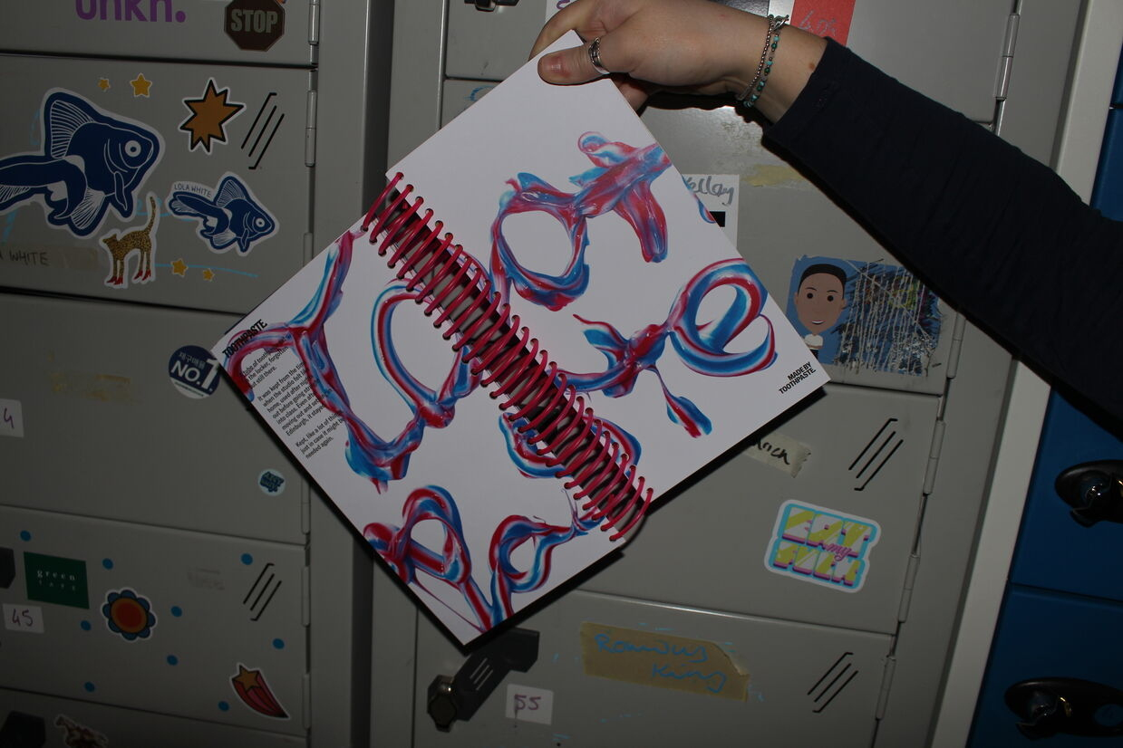
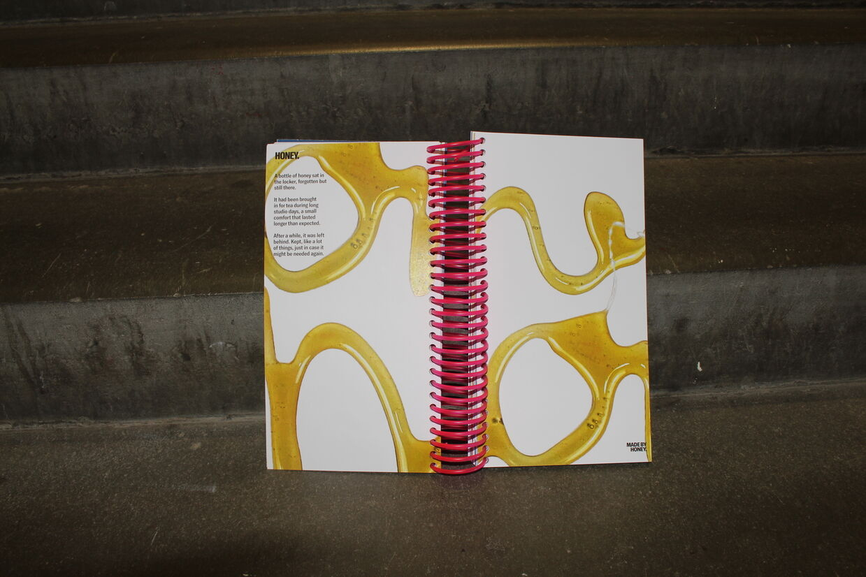
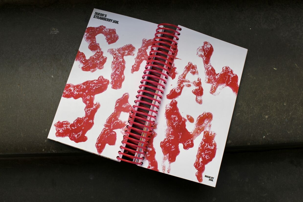
The publication focuses on these overlooked possessions, documenting the random assortment of things that accumulate inside lockers over time. Each object is organised alphabetically and transformed into its own typographic composition, giving significance to items that would otherwise be ignored, forgotten, or thrown away. By bringing order and attention to these hidden collections, the book reveals a unique portrait of student life through the everyday objects kept behind closed doors


PRCOESS PHOTO
PRCOESS 6
PROCESS 2
PROCESS 5
Project description

Glashaus

Is a contemporary music and cocktail lounge inspired by the creative spirit of Bernat Klein. Bringing together live music, carefully crafted drinks, and thoughtfully designed interiors, the venue is designed to create a welcoming and immersive social experience. Influenced by the large glass windows of the Bernat Klein Studio, the visual identity is built around expressive, organic typography that captures a sense of movement, atmosphere, and connection.

The project explored how typography could become more than just a communication tool, instead acting as the heart of the brand itself. Moving away from rigid layouts, the identity embraces a fluid and playful visual language that feels dynamic and engaging. Inspired by Klein’s experimental use of texture, colour, rhythm, and abstraction, the branding reinterprets his creative approach in a contemporary way, resulting in an identity that feels vibrant, immersive, and full of character.


pages
book
drinks
About Me

Hi, I'm Megan!

I’m a typographically led designer with a passion for creating distinctive and memorable brand identities. Typography sits at the heart of my practice, and I am particularly interested in its ability to do more than communicate information. I see type as a powerful tool for shaping personality, creating atmosphere, and giving brands a unique voice.

My work explores how typography can become the foundation of a visual identity rather than simply supporting it. Through experimentation and a concept-driven approach, I push beyond conventional typographic solutions to create expressive and engaging design systems. My process is highly exploratory and often begins with physical experimentation, using making, testing, and analogue methods to generate ideas and uncover unexpected outcomes. These explorations then inform and shape my digital development process, allowing me to create work that feels both considered and original.

I am particularly interested in how type can communicate emotion, build recognition, and create meaningful connections with audiences.

glashaus degree show photo