Project description

Typography influences the way we read, learn, and engage with the world, yet its role in promoting accessibility is often underestimated. My project investigates how thoughtful typeface design can challenge barriers to literacy and support more inclusive reading experiences. 

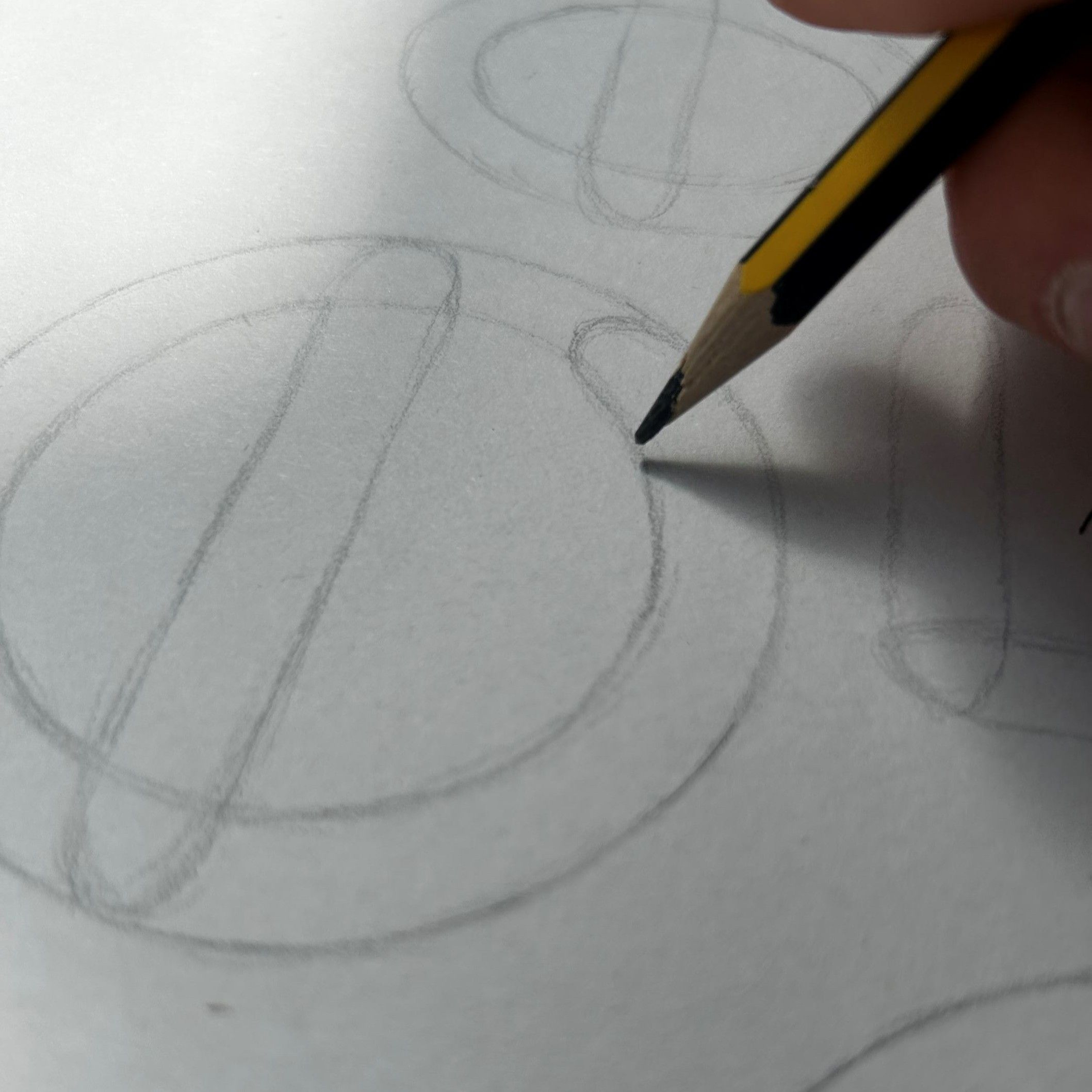
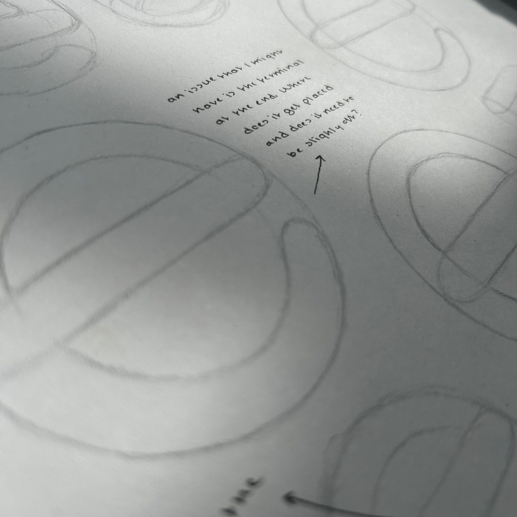
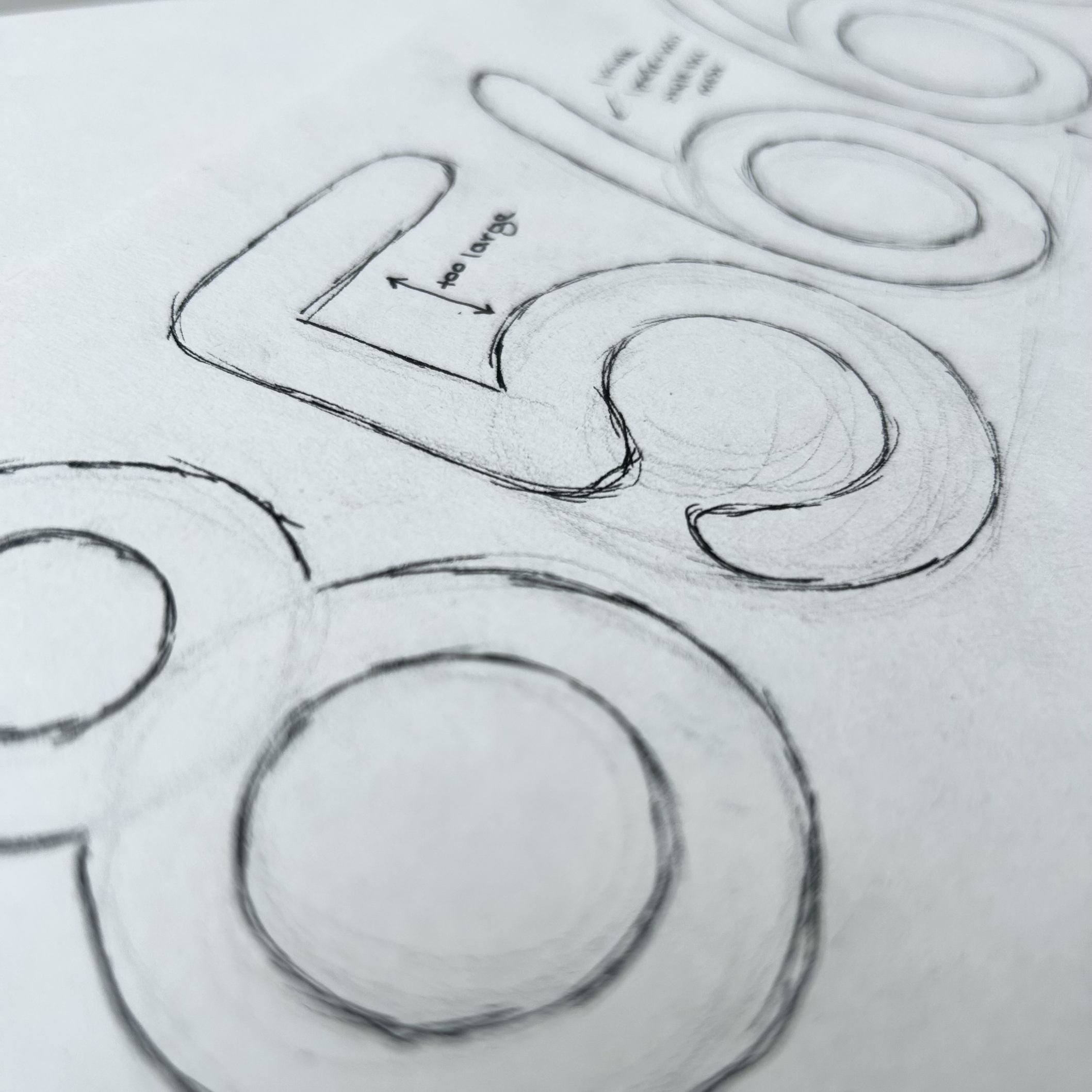
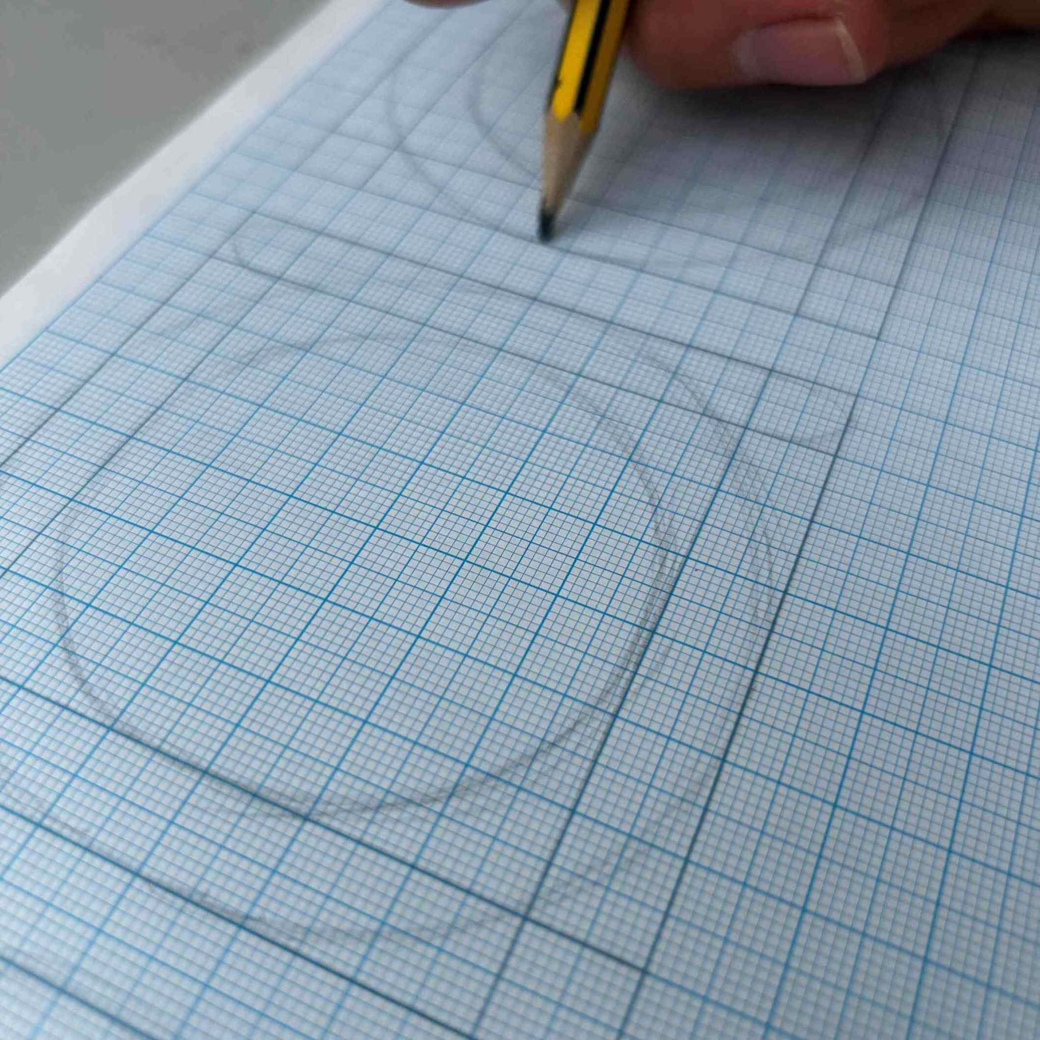
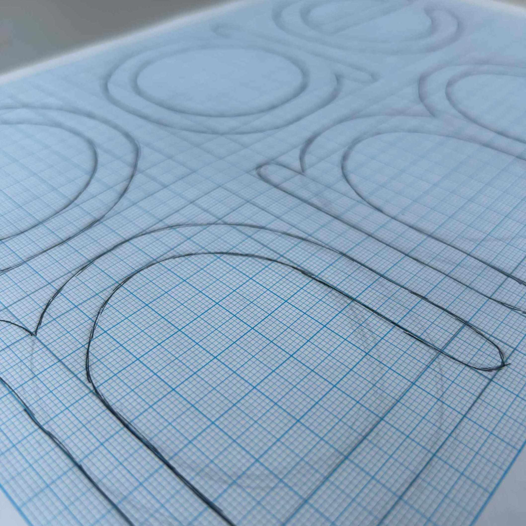
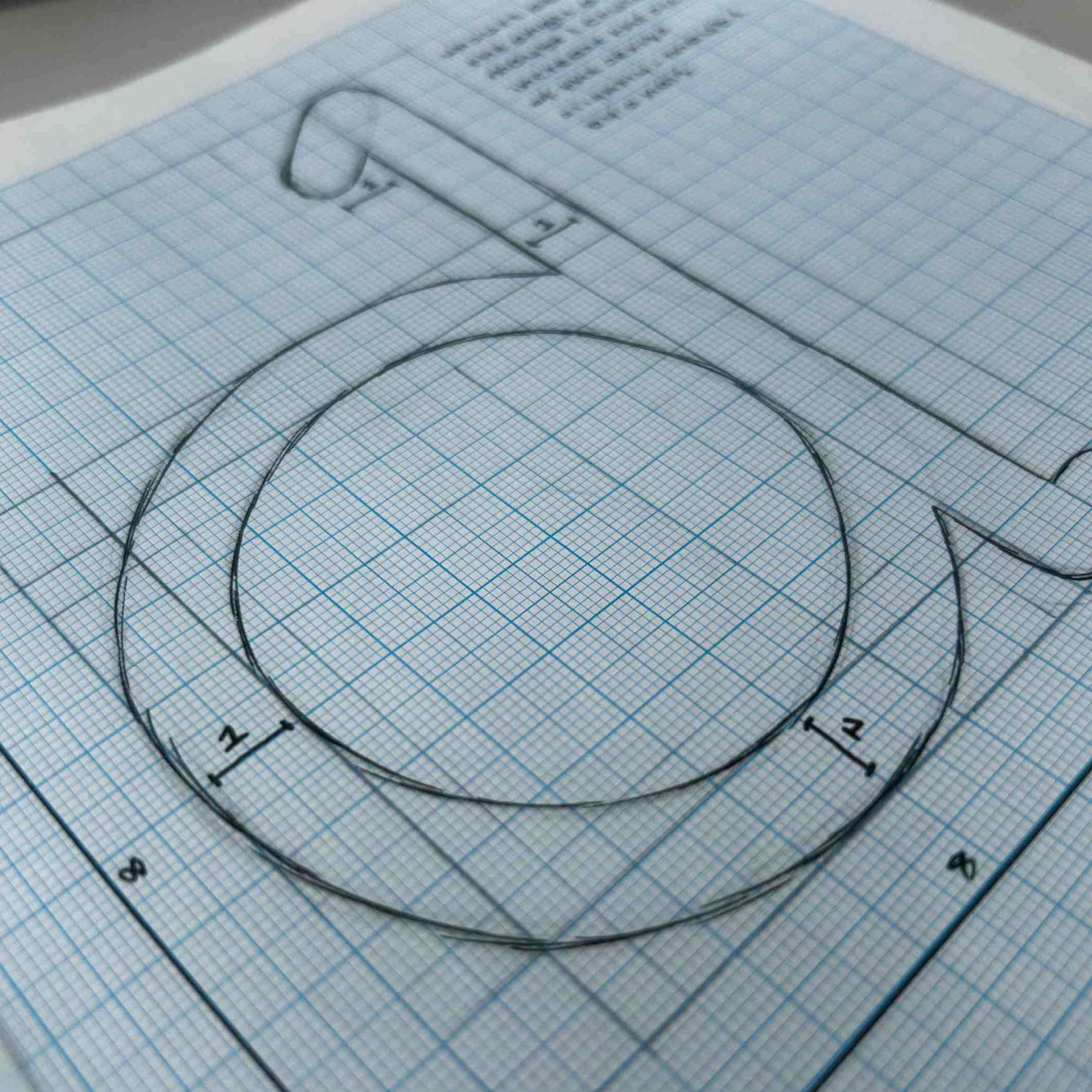
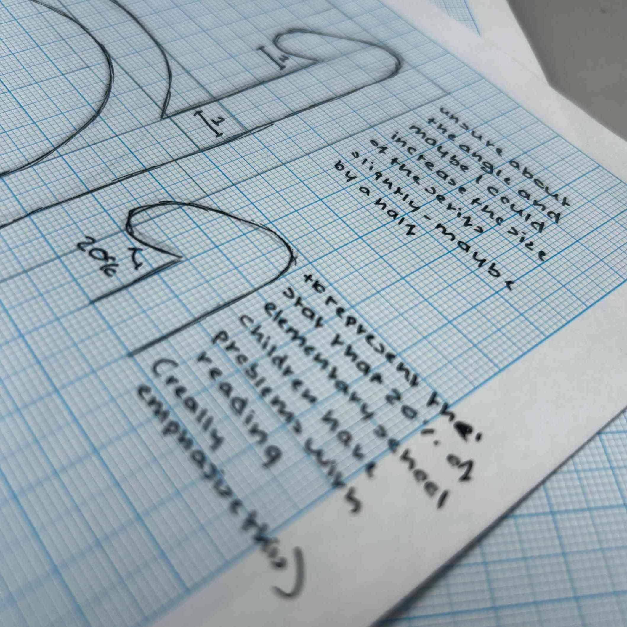
Through research, collaboration, and participatory design, I have been developing AccRead, a free, open-source typeface that is inspired by typographic features shown to improve reading performance for people with dyslexia, all of which has been informed by individuals with dyslexia.  

Focusing on communities where access to specialist support is often limited, my ambition is to make AccRead, alongside other accessible typefaces, freely available through community organisations and awareness campaigns. By improving access to inclusive typographic resources, the project aims to enhance reading confidence, fluency, and engagement, demonstrating how thoughtful typeface design can contribute to more equitable access to literacy. 
Academic literature supports typography being a widely recognised inclusive approach for improving readability and accessibility among individuals with dyslexia. Despite there being hundreds of thousands of publicly available fonts, only a small handful have been specifically designed to support dyslexic readers. Dyslexia-friendly typefaces typically distinguish themselves from conventional fonts through carefully considered letterform designs that reduce confusion between similarly shaped characters, alongside increased spacing to minimise visual crowding, improving reading comfort. 

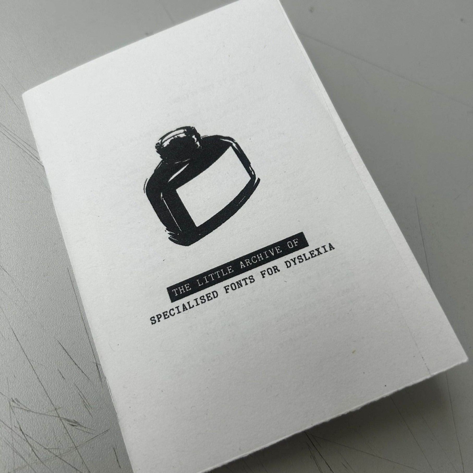
Front Cover of Archive Booklet
Inside of Archive Booklet 1
The Little Archive of Specialised Fonts

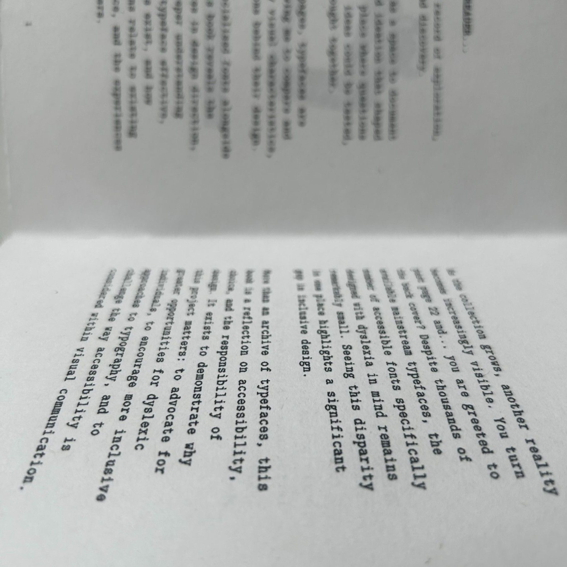
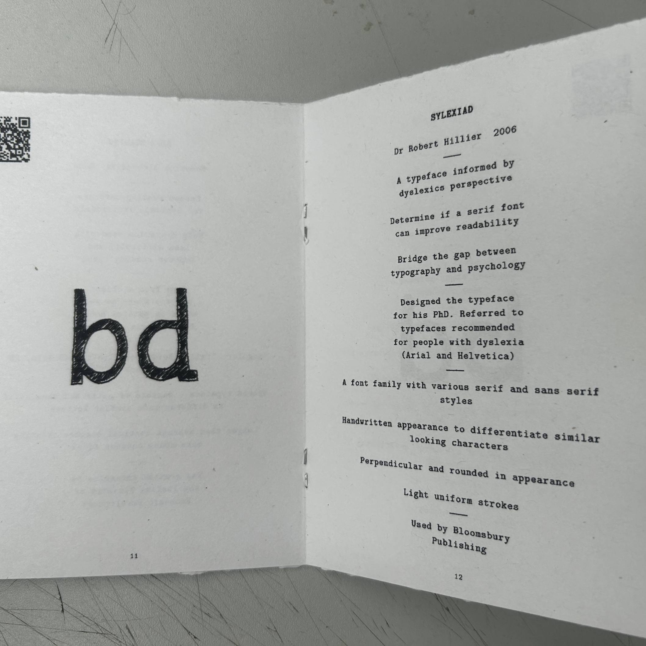
This pocket-sized publication titled 'The Little Archive of Specialised Typefaces' acts as a catalogue that shows what free, accessible typefaces are out there that are designed to support people with dyslexia, alongside sharing key information about each font, highlighting its unique characteristics and design features. By making these resources easier to discover and compare, the archive aims to increase awareness of the small number of specialised typography out there whilst aiming to improve access to inclusive reading tools.

Inside of Archive Booklet 2 expand
Typeface Identity

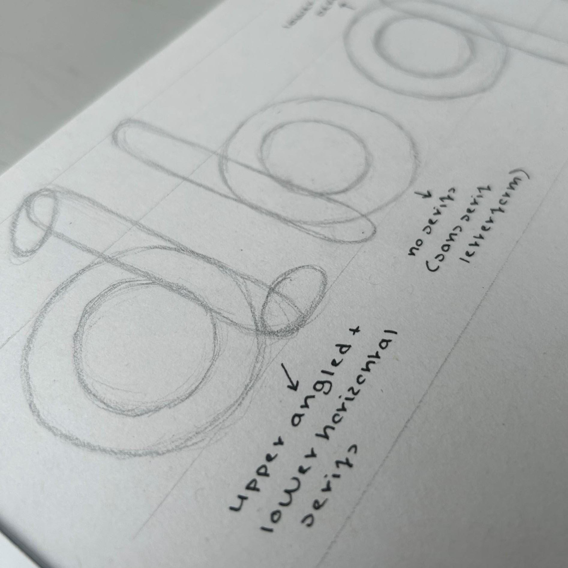
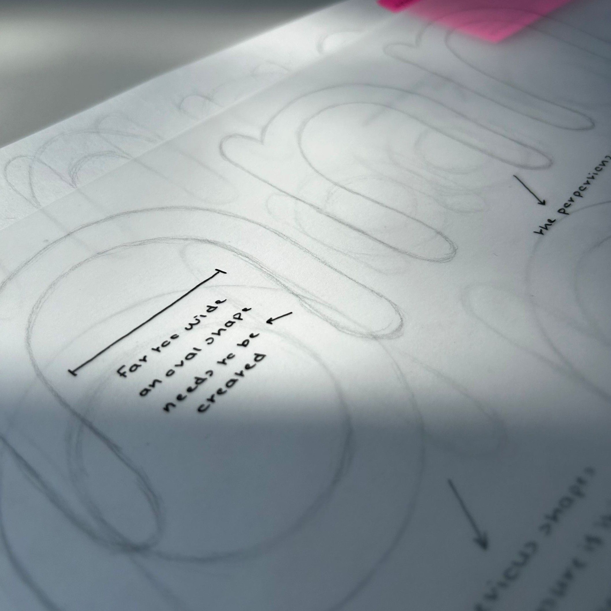
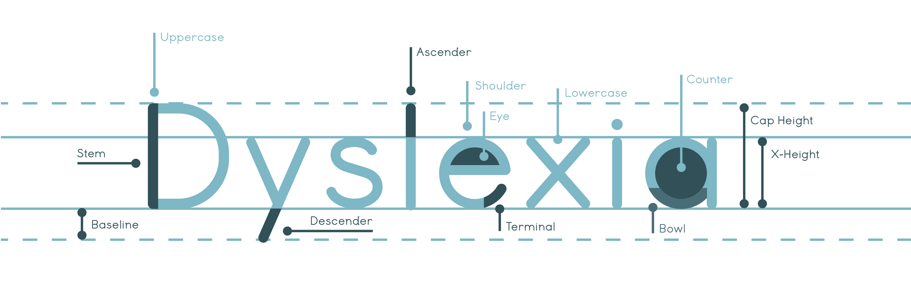
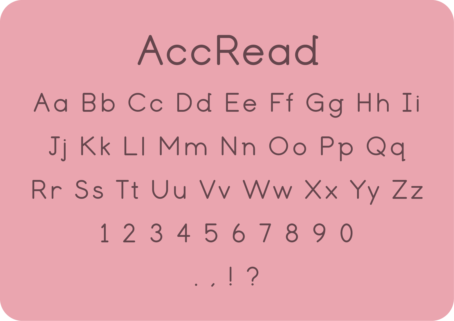
AccRead (short for Accessible Reading), balances readability, familiarity and inclusivity. Its design combines influences from Comic Sans and Times New Roman, creating a hybrid style that merges serif and sans-serif characteristics, making it ideal for body text. AccRead consists of a rounded overall appearance, uniform stroke thickness and subtle serif details to help distinguish commonly confused characters, combining traditional typographic conventions with accessibility-focused design considerations. 

Type Anatomy
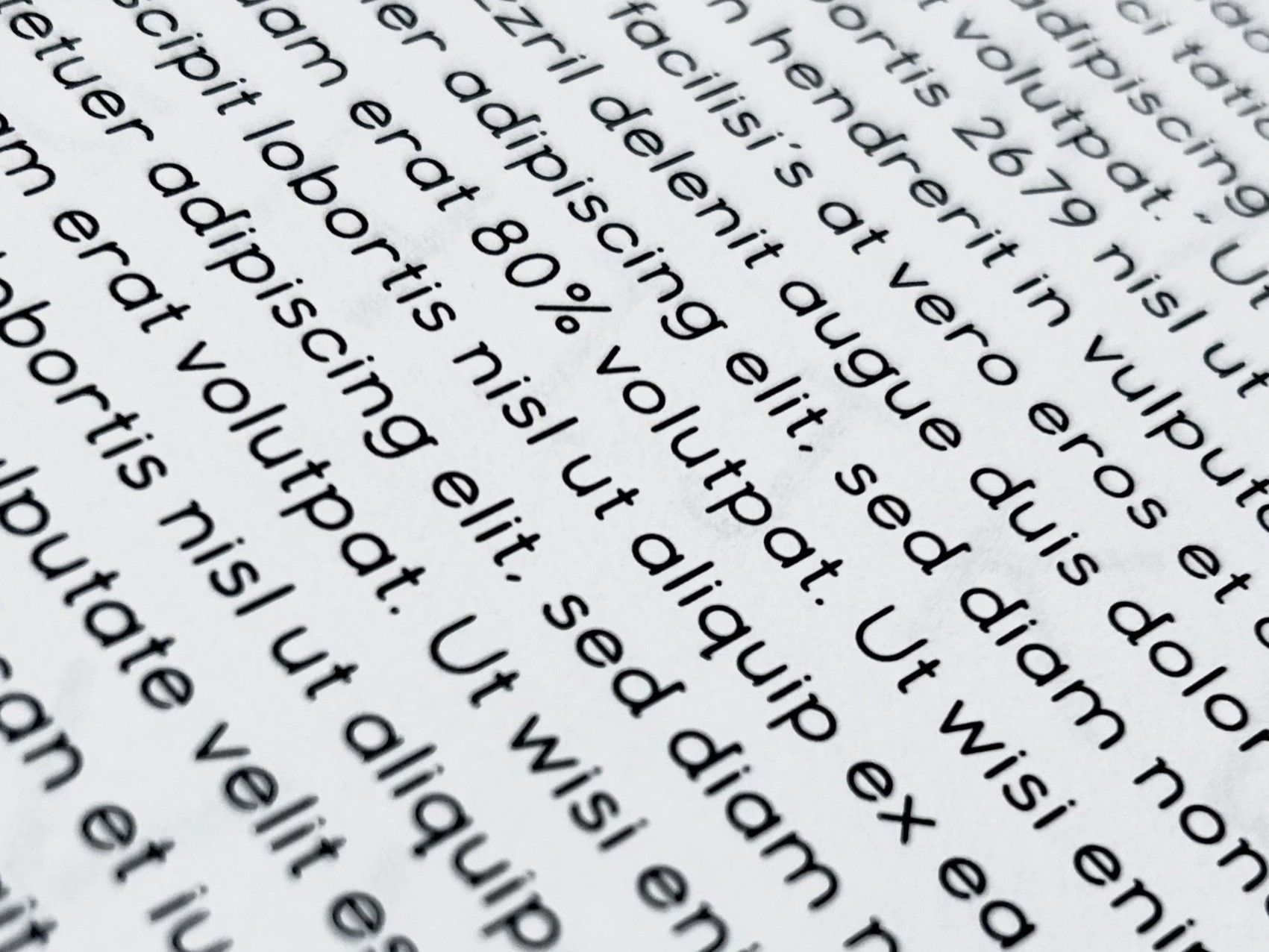
Testing AccRead Print
Typeface Animation
About Me

Hello...

My name is Fraser Stobart. I am a design student from Edinburgh with a passion for leveraging graphic design and typography as instruments for meaningful societal, environmental and inclusive change. 

My work is driven by a desire to reconnect with communities, ignite meaningful conversations, inspire curiosity and challenge the traditional boundaries of design. 

I am deeply motivated about this field, and I am confident that my skills and experiences will enable me to make valuable and lasting contributions.

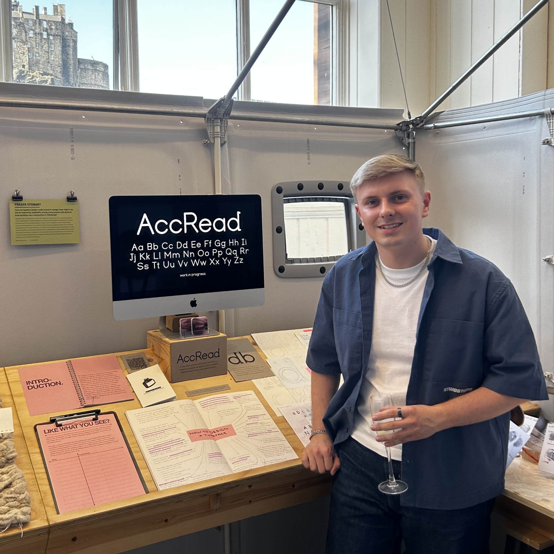
Image of me 2

Fraser Stobart

Designing for Dyslexia: Typeface Design as a Tool for Inclusive Change
Related topics